
Sherwin Williams Sea Salt and Rainwashed: Prettiest Colors For Your Home!
Don’t you hate buying paint and getting home and wishing you’d chosen another color?
Yep. Me too.
But I guarantee that’s not going to happen this time because, hands down, Sherwin Williams Rainwashed and Sea Salt are two of the prettiest, softest colors that never fail to disappoint.
I’m obsessed with these colors. In fact, three of my rooms are painted these colors:
- My master bedroom (Sherwin Williams Rainwashed)
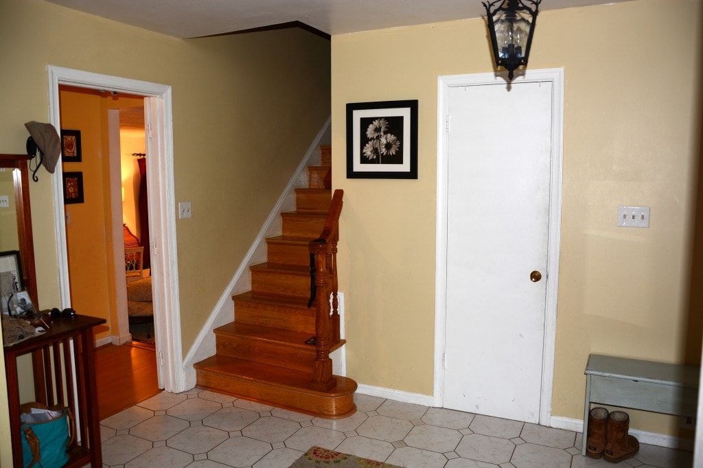
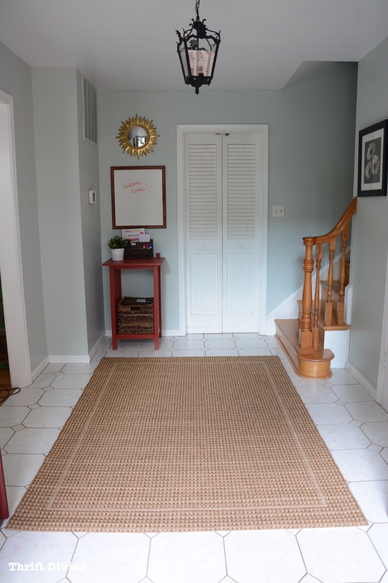
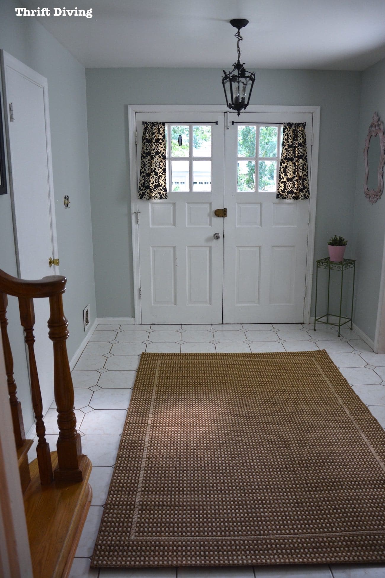
- My foyer/entryway refresh makeover (Sherwin Williams Sea Salt)
- My master bathroom (Sherwin Williams Sea Salt)
Hopefully, stumbling upon these pics will help you to make a decision to use them, because they’re that fabulous!
Sherwin Williams Rainwashed
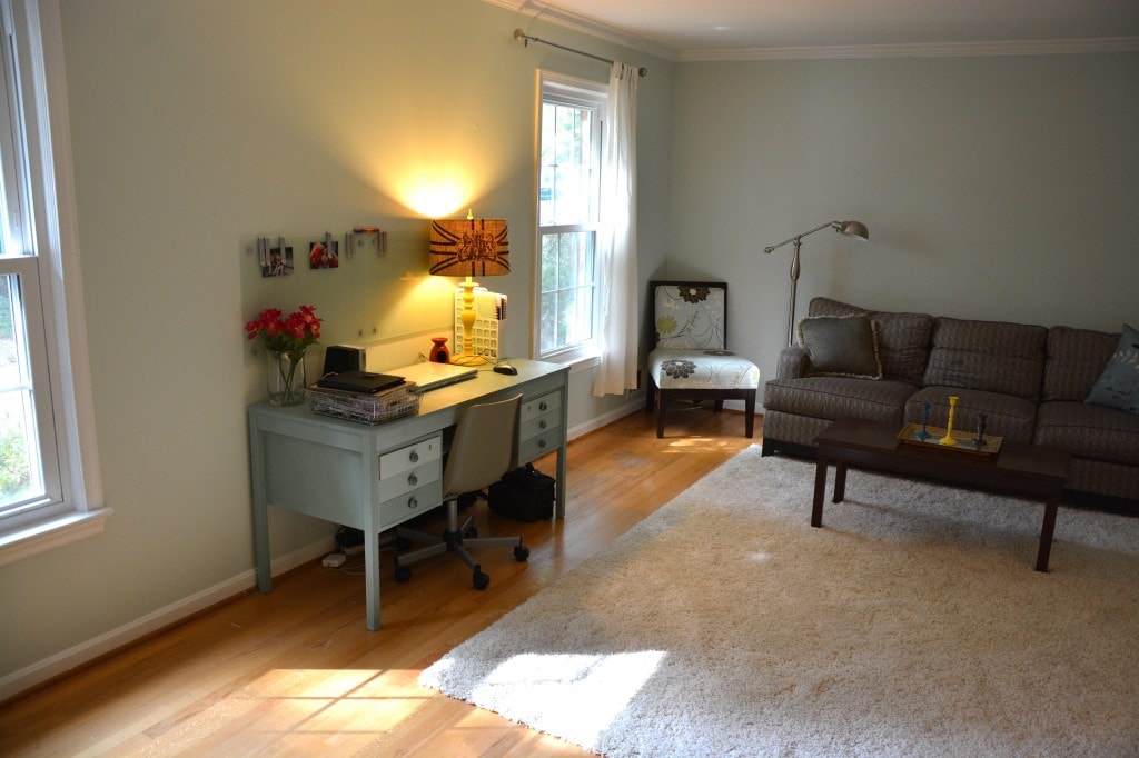
Rainwashed is probably my most favorite color of all times. When we moved into this old 1973 house in 2010, I couldn’t envision what I wanted my bedroom to look like. Our old bedroom was a soft buttery yellow with deep red accents. A little too “warm” for my taste in this “new” old house. Instead, I wanted something cool, soft, and felt like an oasis when I walked in! This is what my bedroom looked liked prior to its total overhaul, funky 70’s quilted drapes and all!
BEFORE
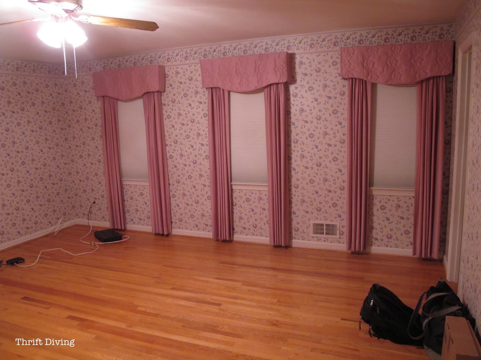
The wallpaper needed to come down first. That was a complete nightmare! I wouldn’t wish wallpaper on my worse enemy! (Well…actually, that could be satisfying, but I digress….LOL). We used an amazing wallpaper steamer that I bought from Amazon and it worked really well to pull down the wallpaper. But the wallpaper left a bunch of sticky glue
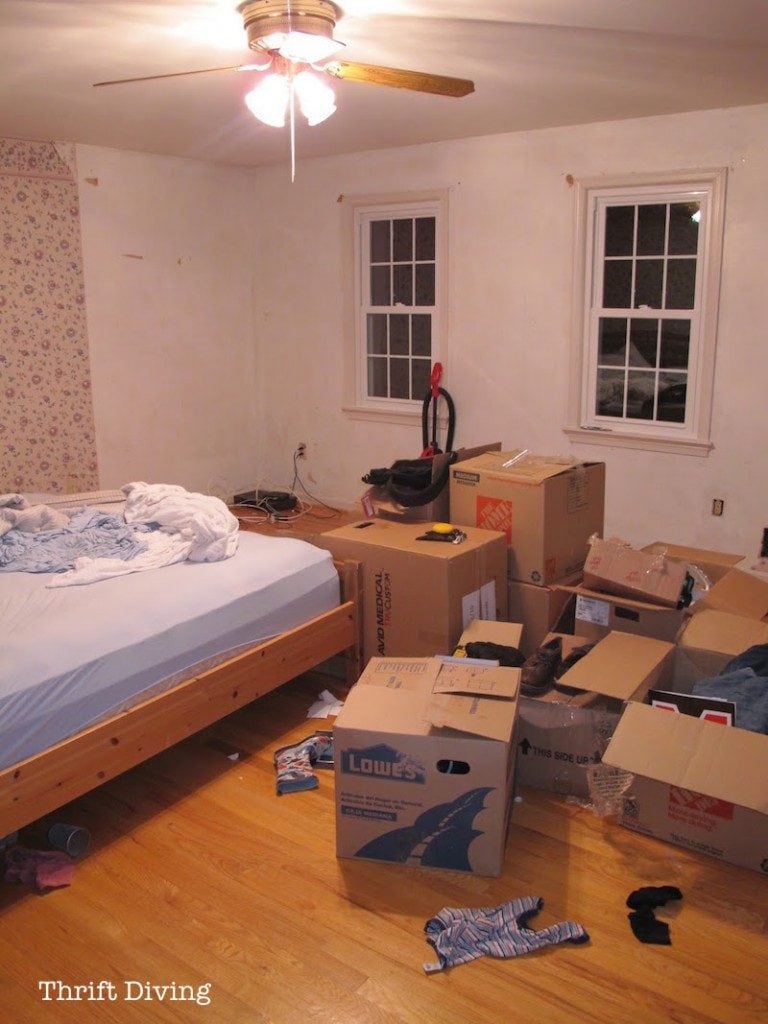
AFTER!
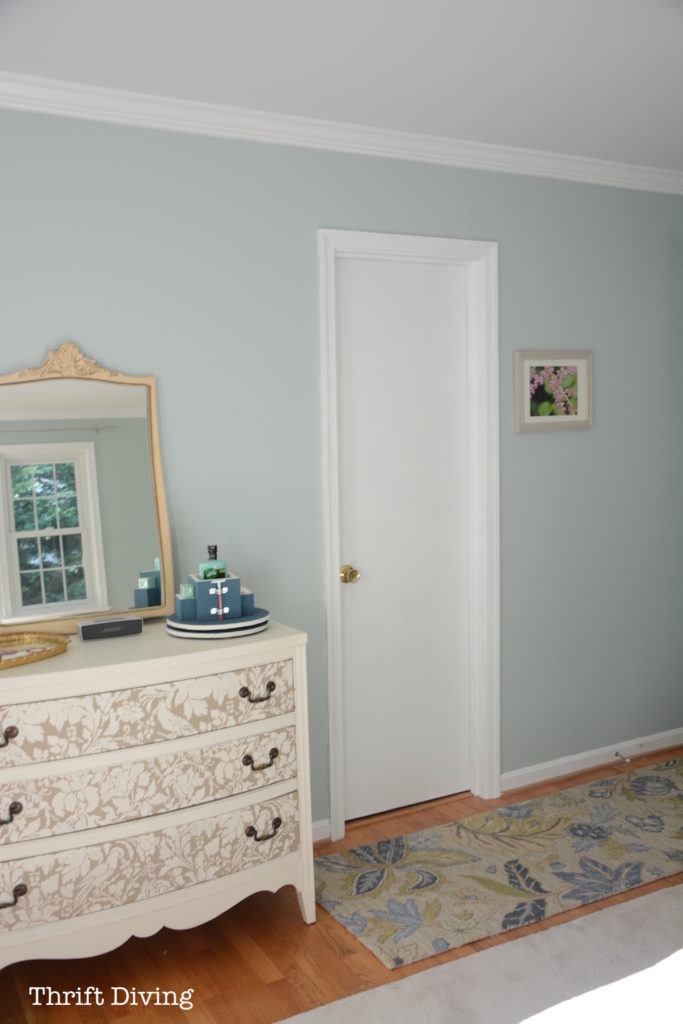
Once the wallpaper was gone…once I added the DIY crown molding…what resulted was this soft, prettiness! This is Sherwin Williams Rainwashed. AH-MAY-ZING…… What’s crazy is that in the years since moving in, not once have I ever felt like re-painting over the Rainwashed. Other rooms in my hous, however, have been painted over at last once or twice. But not this room. The color is too divine!
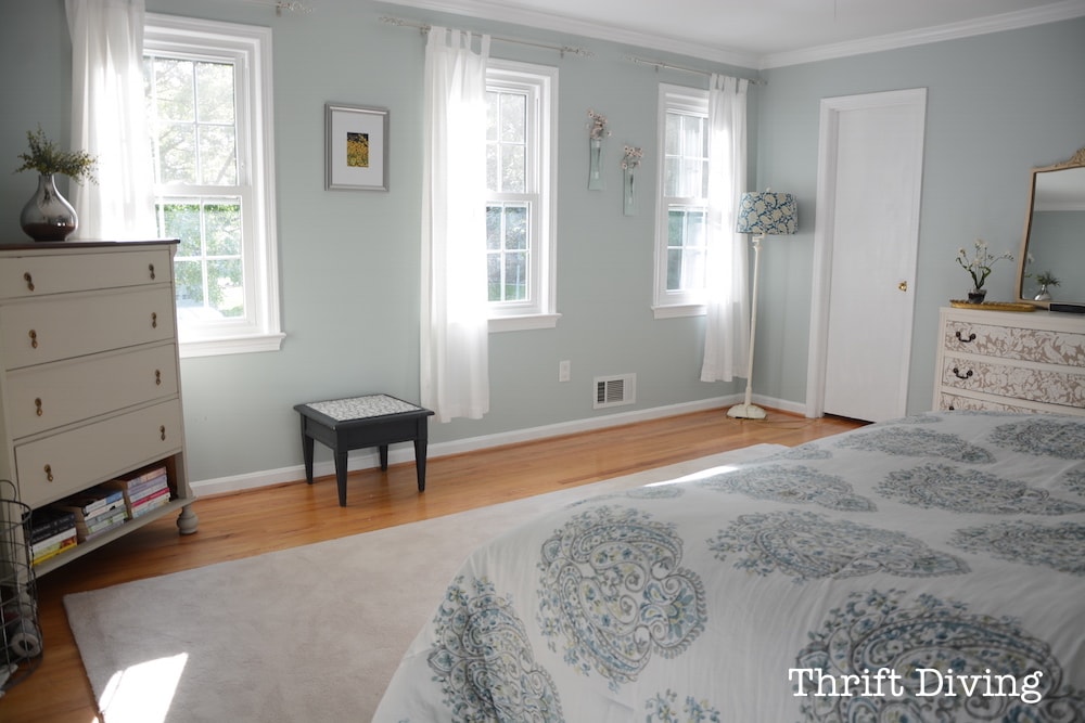
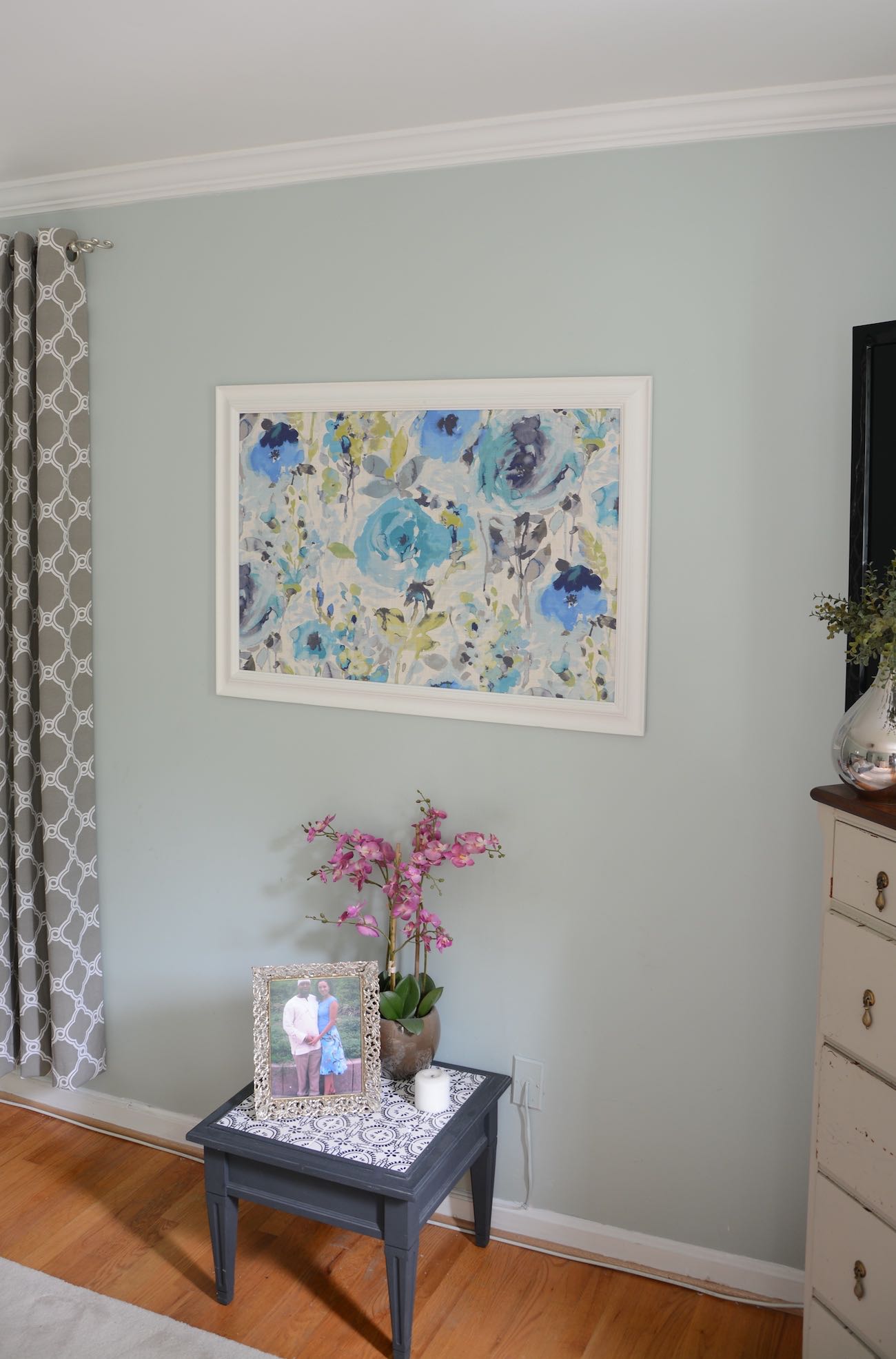
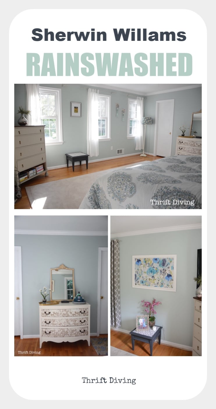
Here’s another shot of Rainwashed in my master bedroom. Isn’t it such a light shade of turquoise blue-green? Everything you see in the image below was thrifted or made my hand!
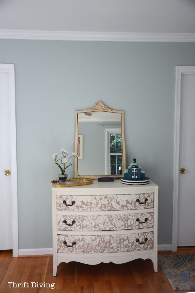
I had found this frame at the thrift store and figured out how to frame fabric with a picture frame. I love how it looks on my master bedroom wall with the Rainwashed.
Psst! Check out how I used Sherwin Williams Abalone Shell in my family room!
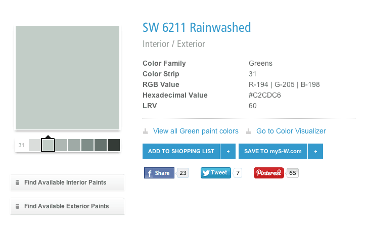
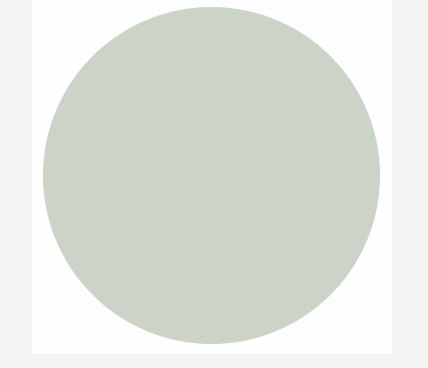
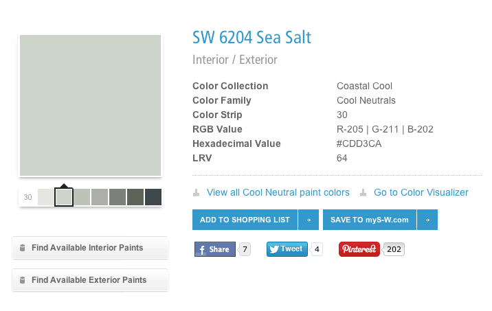
It’s funny, but when you look at it on a color card, it looks nothing like what it does on your walls, depending on the time of day. It’s like the magician of paint colors. According to this swatch, it’s in the green family, but sorry–my walls say something different!
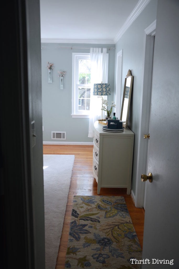
When I walk into my bedroom, it feels like an oasis!
I installed the crown molding myself (I wrote a 52-page step-by-step guide on how to put up your own crown molding like a novice. Download a copy of the ebook).
Sherwin Williams Sea Salt
Sherwin Williams Sea Salt is another paint color that is a bit of a magician when on the walls.
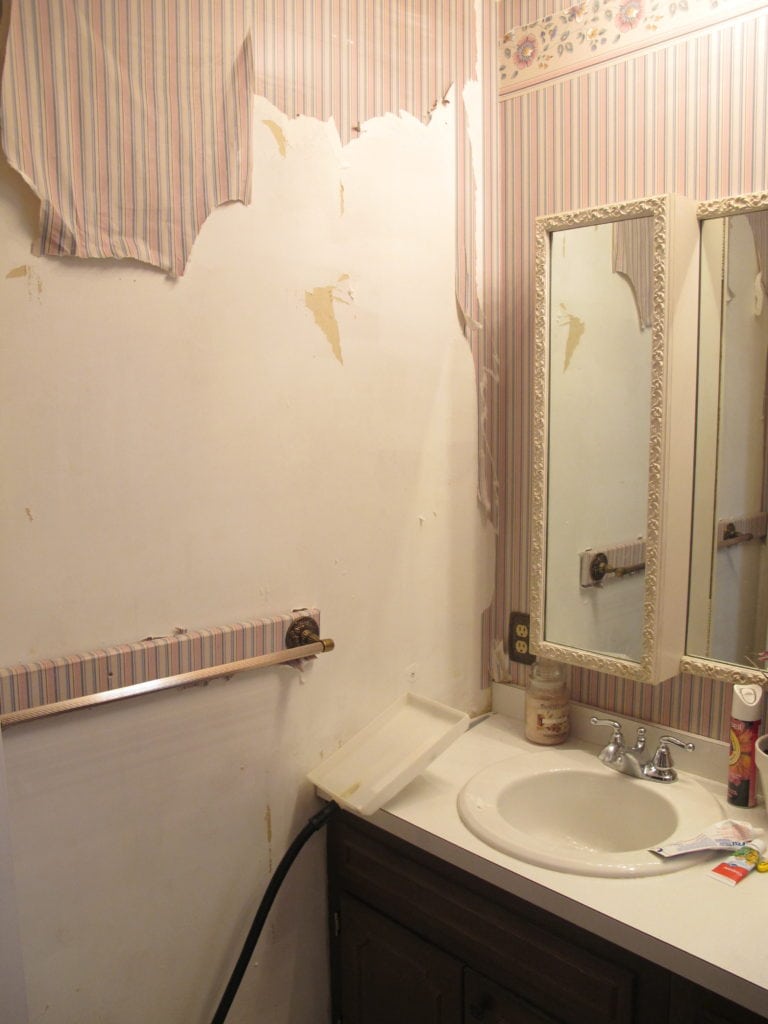
This is what my master bathroom looked like when we moved in. It was a hot mess. But I knew that Sherwin Williams Sea Salt would look amazing in this room. It has a calming effect and looks good with shades of gray and white. Here’s what my master bathroom looked like before. In this room, it actually does look greenish:
BEFORE
AFTER!
What do you think? It looks like a very light seafoam color. Excuse the horrible pics :). These are old cell phone pics!
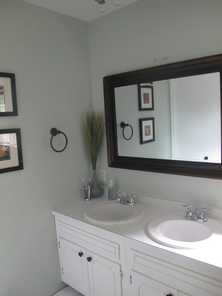
As much as I loved Sherwin Williams Sea Salt, later I wanted a change for my bathroom.
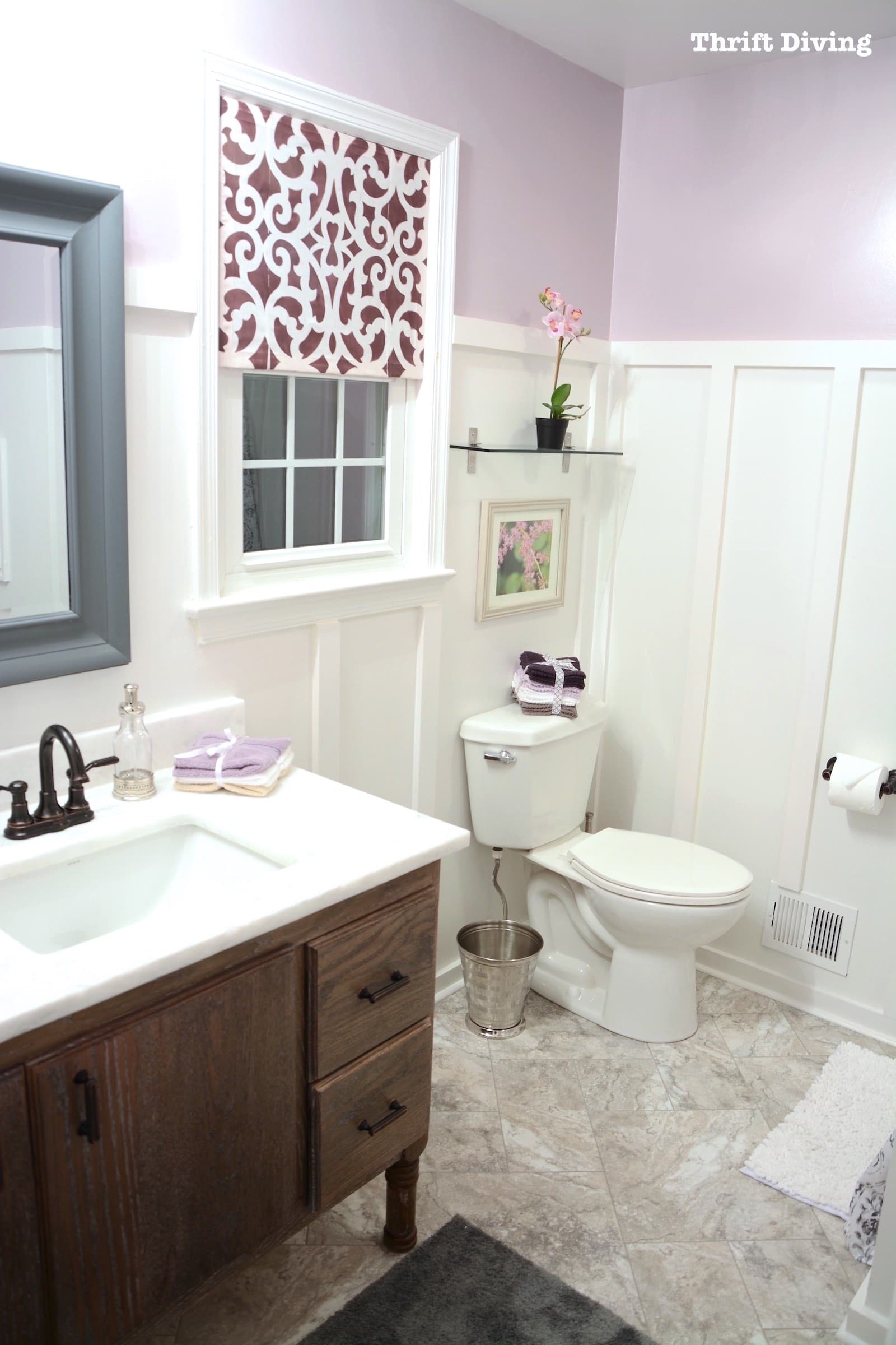
So I’ve since done a master bathroom makeover and it now looks like this!
RELATED: See how to make this master bathroom makeover, which doesn’t require hardware to stay in place, and you can move it up and down!
Anyhow, back to my foyer….
In my foyer, Sherwin Williams Sea Salt looks more light-bluish/turquoise in the afternoon sun!
BEFORE
AFTER!
In my foyer (click here to watch how I touched up the Sea Salt for an entryway refresh makeover), it sometimes looks a shade of blue, depending on the light. The color is very soothing and I can’t believe I ever chose a depressing, dark yellow.
Never again!
I love how fresh Sea Salt feels when I walk in! And what’s crazy is that when readers send me pictures of their house, showing off their projects to me, the minute I see Sea Salt on their walls, I’m like, “I know that paint color!”
Worried?
You probably found this blog post because you’re researching Rainwashed or Sea Salt. Don’t worry. They’re great colors that make the walls feel airy and pretty. Sometimes they look greenish. Sometimes they look blue. Maybe turquoise. And sometimes you do feel nervous when you’re about to paint and you’re not quite sure what you’re going to get. But I love these colors so much; they never disappoint.
Even my kids love them ;).

Sherwin Williams Abalone Shell and City Loft
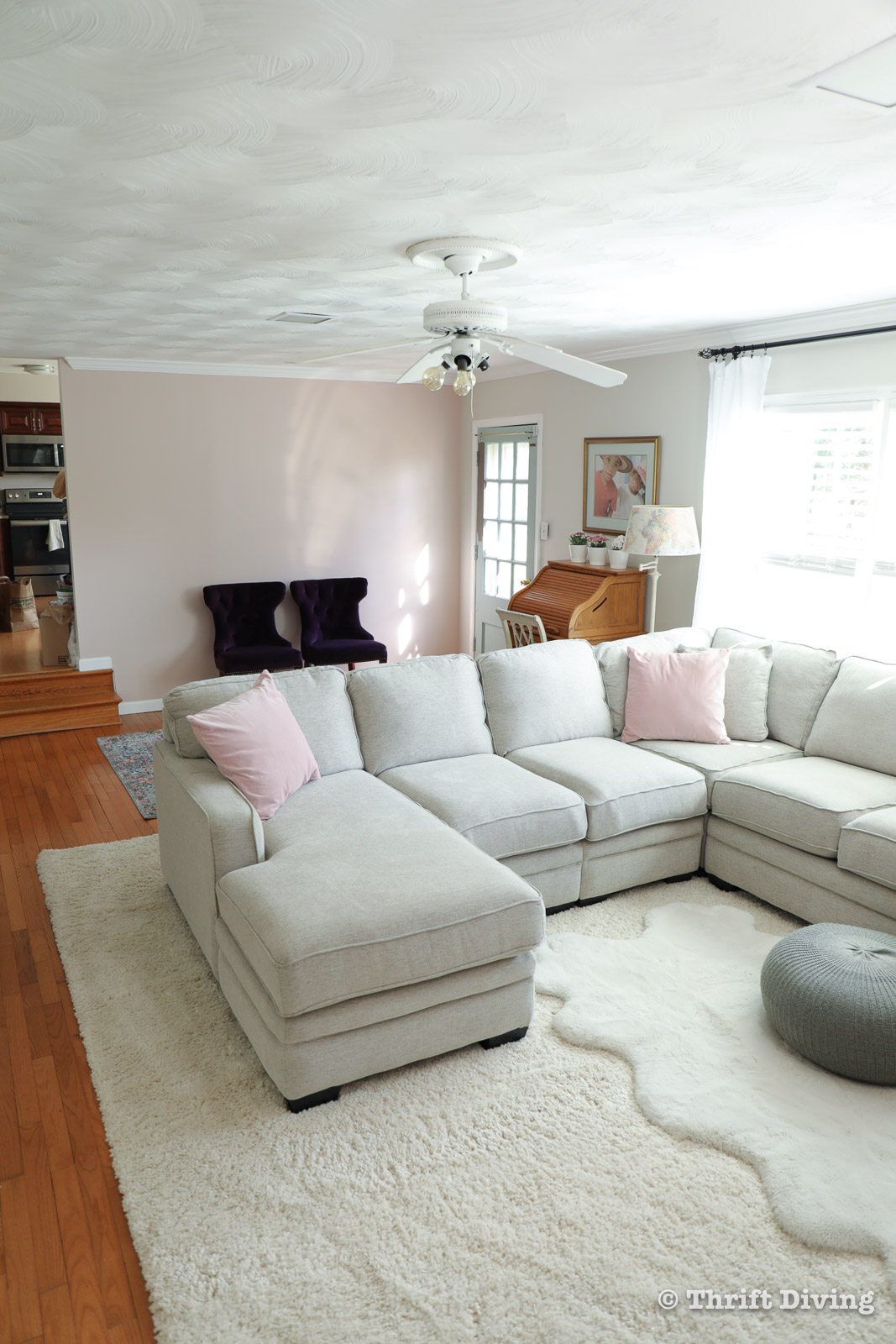
I absolutely love Sherwin Williams paint colors! I recently completed a family room refresh and I used Sherwin Williams Abalone Shell as a blush pink accent wall, and the rest of the walls are a gorgeous Sherwin Williams City Loft, which complements it so well! Click here to see the entire family room makeover here.
Want to save this blog post? Just click here to SAVE it on Pinterest!

How to Pick Awesome Color Combos
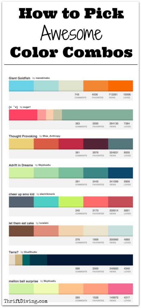
Choosing colors that look good together is tough. If you need more help picking color combos, then check out my other post: How to Pick Awesome Color Combos
Watch the Video!
If you want to check out Sea Salt in action, watch my video, where I’m demoing the Home Right EZ Twist paint stick. Maybe you can get a hint of what the paint looks like.
Sherwin Williams Window Pane
I can’t help but mention, I also love Sherwin Williams Window Pane, which is one color lighter on the same color card as Rainwashed (see above). It’s also a very turquoise paint color. I have used it in my reading room, and it’s just as beautiful and soft. And yes, that was a baby on my back. LOL
BEFORE
Same “yuck” beige in the reading room….

IN PROGRESS!
A gentle hint of greenish turquoise paint on the walls. Ahhhh….LOVE IT!
Psst…Check out these other projects in my master bedroom!

Have you used Sherwin Williams Rainwashed or Sea Salt in your house? What did you think? Leave a comment below and let me know!

Download the 5 freebies!

Thrift Diving inspires women to decorate, improve, and maintain their home themselves...using paint, power tools, and thrift stores! Use these 5 printables, checklists, and ebooks to get started!



I love theses colors. I used a very similar color, Behr’s pale vista in my halls and dining room and it is by far one of my favorite colors ever. It changes with the lighting and is very neutral and goes great with all the colors in the adjacent rooms.
I’m going to have to go Google that! I’m always on the lookout for soft, pretty colors! Thanks, Melissa! 🙂
Hi. Was looking for great examples of Rainwashed and found your site. Now I’m SOLD on the color. Was looking to paint my living room ceiling a color like this for some muted drama. I think it’ll look great after seeing your pics. thanks!
Awesome, Teri! 🙂 Glad you were inspired! 🙂
Serena, I love your Rainwashed photos. You have a lovely, light-filled bedroom that really shows it off. I have a couple of gallons of it (picked up during a 40% off sale) and had planned to do my main living areas, but now I’m not sure. Those areas of my house tend to be dark, and now I’m thinking that the test area I painted on my dining room wall is deeper and bluer than I’d wanted.
So, I am wondering if you’ve ever played with a paint color yourself by adding a tint (such as black, to create more of a muted look) or by diluting it with white. Or would the paint store be willing to do that after the purchase?
I was in Utah looking at models and this one model was painted in Sea Salt and Aloof Gray and I just fell in love with the way it made me feel. I was so surprised and happy to see your blog using this color too. I will have to check out the Rain Washed too. My husband is a little hesitant to do this color over our safe tan walls. But I am ready for a change. My only question is this. My house has quite a bit of red touches. My kitchen is red and white …just darling I might add 🙂 but I think Sea Salt would look really fresh with the pops of red. What do you think? Also, I am a BIG CHRISTMAS DECORATOR. I like the traditional reds and greens and silver and gold too, I hope this color goes with all that and my red white and blue for the summer months.
Anyhow, thanks enjoyed your video.
Judy 🙂
Hey there, Judy! Funny you mention that because I came across Sea Salt and a pretty grey recently, too, and I loved it!! I’m thinking of doing some pieces of furniture in my foyer in grey, to go with the foyer. Thanks for that!! 🙂 Great to hear from you!
P.S. I think red would look great! 🙂
Love the two colors. I am wanting to do sea salt in my living room. And across the foyer I want to do a richer coordinating color. Any suggestions. Foyer is Benjamin Moore revere pewter.
I have rainwashed in my kitchen and master bedroom, love it! It’s been 7 years so I am thinking of freshening up but I love the color so much I just don’t know if I can. 🙂 I am glad to see someone likes it as much as I do.
Hey Amy! I know what you mean! I just added crown molding to my master bedroom and couldn’t bring myself to paint over the rainwashed. LOL. It’s such a pretty color!!!! Thanks for stopping through!
Thank you so much for you super quick reply as I am currently obsessing about painting and redecorating. I live in Washington state, so oh well. Thanks again! You and your kiddos are real cuties
I am thinking about sea salt for my kitchen/family room/hall and entry. I like the coordinating eider white but I think it’s a little dark for trim. What color did you use for the trim? Your place looks great! When can you come over and help me? …kidding
Hey Liz! I wish I could! LOL. Where do you live? I’m in Maryland.
For trim, I’m very boring. I always try to use basic ultra white. I think it looks crisp and cleaner, so I go with the same for everywhere if I can! LOL
You’ll love Sea Salt! Verrrrry pretty!!
well I ended up reading your great post because I painted my bedroom and bathroom with sea-salt and…oh my…it is not what it looks like on the chart or in any of the many pictures on line, I almost thought I was given the wrong color!
I knew it was a color that could change with the light but in my rooms look like a deep and I mean deep turquoise or blue sky,( deeper and bluer than you foyer) there are few areas were it resemble the color I thought it was, but overall is just a deep aqua/blue. it is too much I would like it to be lighter and more soothing….where is the grey????
these two bedrooms don’t have a lot of light, so in my opinion the color looks different and deeper. So YES I am disappointed because I can see it is a beautiful color but is not working in my room. aww what can I do? I am considering to repaint it with maybe a lighter shade or half or even less strength of seasalt, do you have any suggestion?
I also painted my kitchen with ancient marble SW a grey/green muted color as well, it is a beautiful color but I have maple cabinets and wood frame window in their natural color and I think this color would perform its best with white so I am still trying to understand if it is ok or not.
Did I say it was a disaster paint project?
You are doing so many great project maybe you can give me some advise.
Thank you
Hi Claudia! I’m so sorry that you’ve dealing with a painting disaster! I had one of those myself when I lived in my condo. Painted the whole living room and dining room a shade that ended up too dark the next day. I ended up having to repaint the whole thing. And the worse part is that I had vaulted ceilings! YIKES!
In your case, I would recommend repainting with a coat of something else. The only way you’re going to know what works would be to get small $3 samples and paint pieces of paper (maybe go to the dollar store and get 3-foot poster board. Then paint those and see how they look with the quality of light in your room. I hate having to go through all those steps, too, but it may be what you have to do to see what color works best in your dark rooms. You could always move up the color card from the sea salt so that the lightest color on the card will maybe be the shade you’re looking for. Another idea would be to use the sea sale you have (if you have any left) and add pure white to it. Again, test it with blocks of painted poster board to see which shade you like best. Just be sure to mix a large enough batch to use all at once, otherwise you might end up running out of custom mixed Sea Salt and not be able to make an identical batch just like it!
Hope that helps!!!