How to Pick Awesome Color Combos
One thing I’ve always struggled with is how to pick the best paint color combos. You’d think I was colorblind. Seriously!
Thankfully, I absolutely love turquoise and soft feminine colors for my walls and furnishings, and you can only mess up turquoise so much, right? 😉
But sometimes you want something more than turquoise and white! I love soft colored walls, but with pops of color on furniture or pillows or accessories. But at times, I’m like, “Oh, man….what colors really go well together?!” I suck at color.
As most of you know, I just paid a crap-load of money to cut down a horribly oppressive maple tree in my backyard. Now, there is tons of light in what used to be our “cave” of a family room.
Now, with all this light and airy feeling, it’s a happier place, and I’m ready to pick colors that are going to finally make this room feel decorated!
So I decided to share my favorite places to get ideas for color combos that will be a no-brainer (aside from the obvious Pinterest…). Here goes!
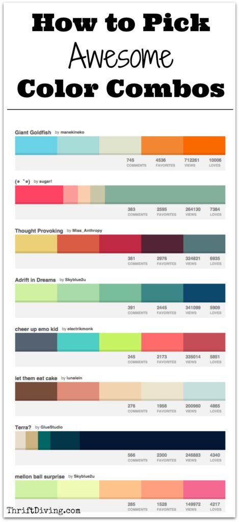
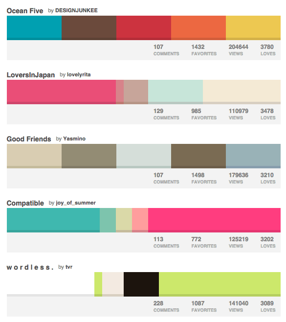
1. ColourLovers.com
I discovered Colour Lovers a couple years ago and it’s been one of my favorite sites to browse colors that look best together. It’s totally community-generated, and people can “love” a color combo. The more “Loves” it gets, the more popular it becomes. It’s a great way to see what is trending on the site.
What’s cool is that if you’re a blogger or novice website designer (like me!) it’s a neat way to get some ideas for color combos for websites, too! 🙂 Love that!
I also use this for ideas for painting some of my furniture projects.
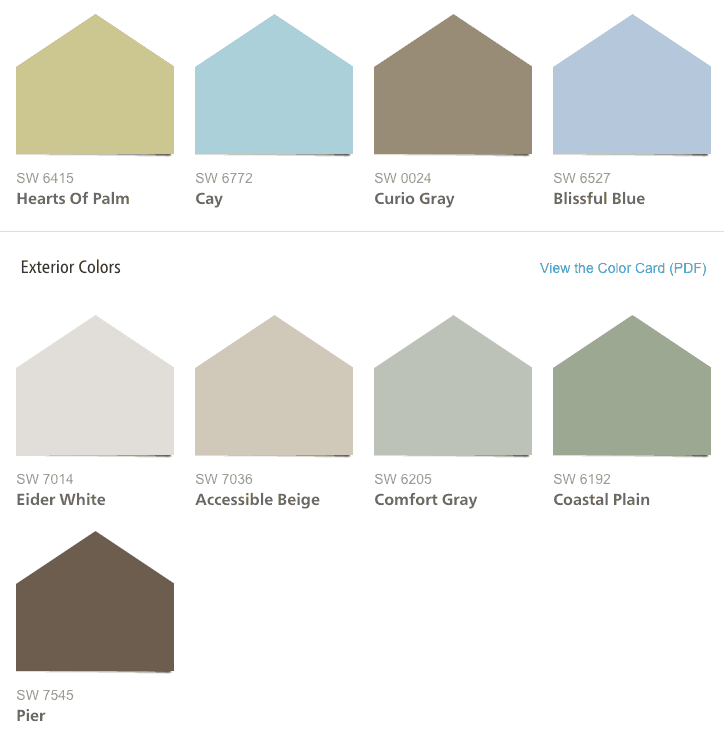
2. Sherwin Williams Color Palettes
My favorite of their 8 color collections is the Coastal Cool. When I was designing my kids’ navigation-themed bathroom, I had found a great blue for the walls, Sherwin Williams Scanda. But I didn’t know what other colors to match it until I stumbled upon their Color Palettes. There are 20 colors in the interior palette and 5 in the exterior palette. They’re designed to all look good together. It really removes the guess-work out of trying to make your home look pulled together.
I may decide to just stick with this color family so that my home has a cohesive look instead of looking jacked up. HAHA.
In fact, I already use Sherwin Williams Sea Salt in my master bathroom and foyer and I love it!
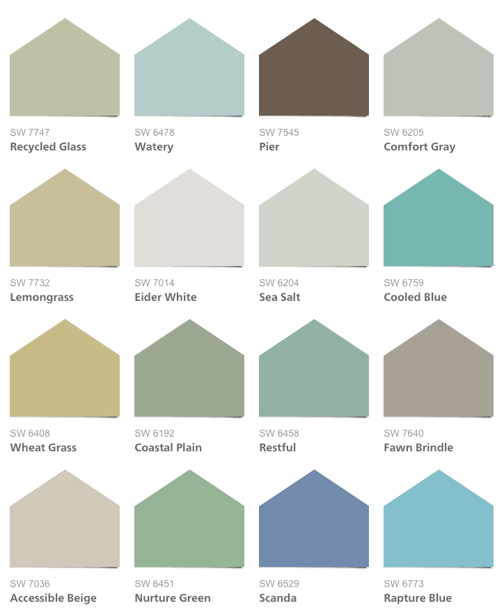
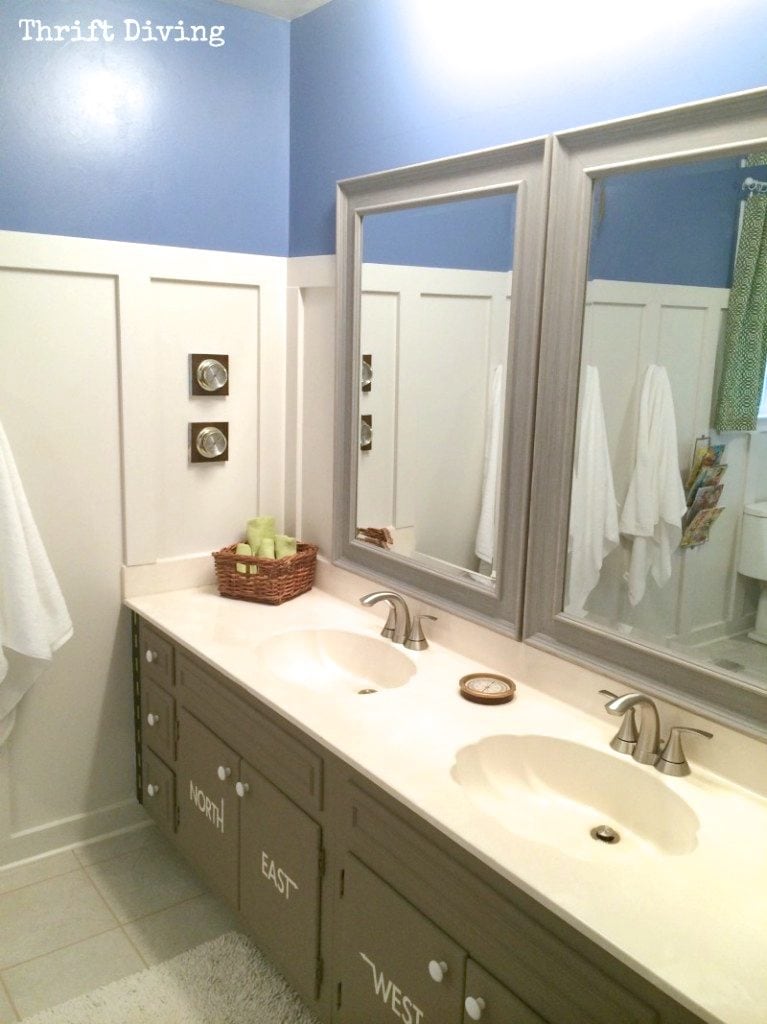
From the Coastal Cool palette, I picked these four for the kids’ bathroom! They looked amazing together!

Here are a couple quick shots of what my kids’ bathroom looked like when I was done with the DIY board and batten (my first attempt! Woo hoo!) and painted vanity. The Scanda and Elder White on the walls looked amazing with the brown painted vanity!

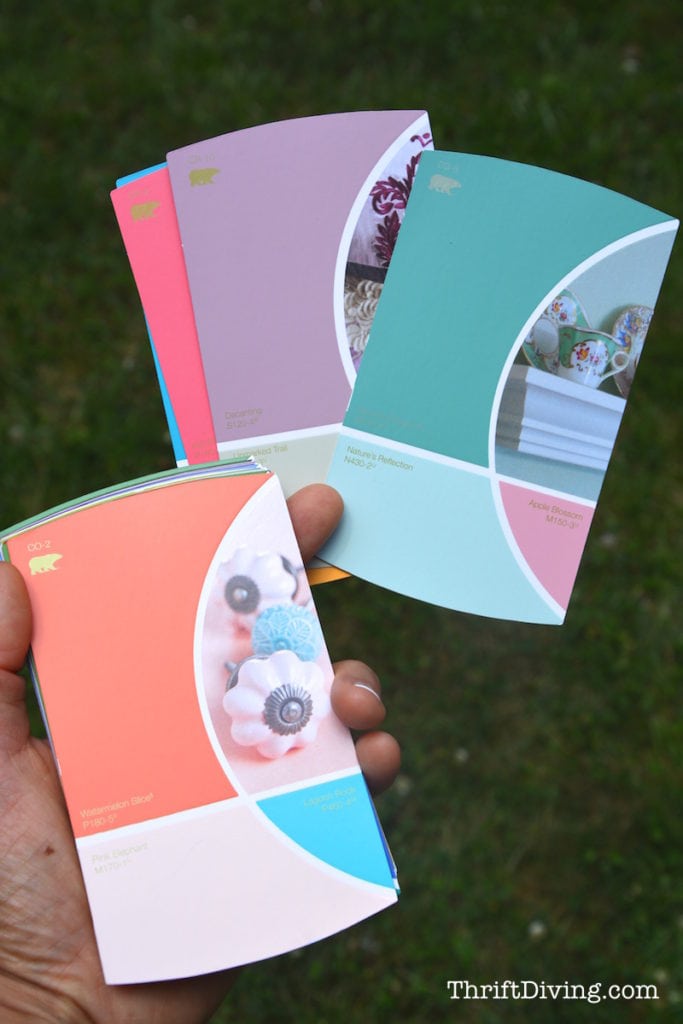
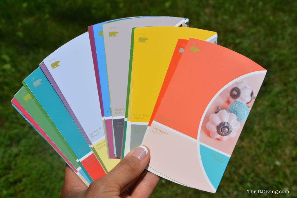
3. Behr Color Combo Cards
The Home Depot carries these amazing Behr color combo cards. Remember their other tri-fold color combo cards? Honestly, I wasn’t a fan of those. I wasn’t inspired by them at all.
These are so much more fresh and pretty! I’m really excited about them. More options, I think. And it really removes the guess-work from choosing something that’s going to work. It’s also easy to hand a stack to my kids and say, “Here ya go! Pick one!” when I’m ready to pick colors for their bedroom makeover.
Call me a lazy DIY’er… LOL
Related: BEFORE & AFTER: Boy’s Blue Accent Wall Bedroom Makeover
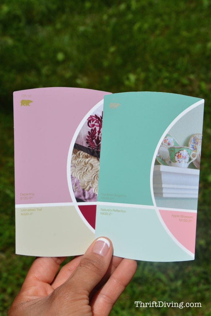
These are my favorite ones below! I’d love to use Nature’s Reflection in my family room! Imagine what a houseful of males would say, though… Hmmm…LOL
Unmarked Trail seems like a pretty neutral, though!
These are awesome!! Seriously, it’s hard to choose!
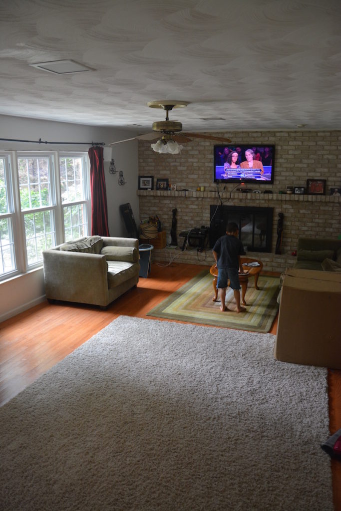
My Family Room
Speaking of which…this is what my family room looks like right now. EEK! It had a few improvements since moving in, like how I painted the old red brick fireplace to still look like brick, and now it’s a faux painted finish fireplace in a taupe color! (see that BEFORE and AFTER in How to Paint an Old Brick Fireplace).
The furniture is old and needs slipcovered and re-stuffed. New curtains…new rugs….ahhh…can’t wait to tackle this room with new paint!
That huge box is my new Stok grill I’ll be setting up for my patio.
Oh, and you see my $5.00 thrifted coffee table! 🙂 Can’t wait to paint that!
Like I said, I usually suck at choosing colors because I don’t want to get it wrong and have to re-do a room because it’s not “working.” But these sites help to squash any “I’m just not sure!” drama that makes me procrastinate when I’m trying to choose color combos.
So what’s your favorite inspiration when choosing color combos? Leave your tip comment below! 🙂
![]()

Download the 5 freebies!

Thrift Diving inspires women to decorate, improve, and maintain their home themselves...using paint, power tools, and thrift stores! Use these 5 printables, checklists, and ebooks to get started!


Sometimes I go to the paint manufacturer’s website… they have some great color combos there and ideas for walls and furniture. Then I jot down the color names and go to Home Depot or Lowes for the paint chips. I am very color-disabled so I need all the help with combos I can get!
This gives me a great idea for this weekend. I took pictures of my work office (which needs to be color coordinated) and will pull out some key pieces at home this weekend so I can plan for my next move. 🙂
Sites are getting easier at helping people figure out color, which is great! I think there are some apps, too, that allow you to take a pic of your room and change the color to test out colors. I will have to find them!
Thanks, Michelle! I’ll check out some sites and see what I can find, too! 🙂 Good luck with your work office!
Hi Serena. Been following your blog for a while. I love your living room and have a suggestion. I used a neutral green Valspar color, Desert Seedling, and never expected so many compliments. It is a soft shade of green. If you look on their websites virtual painter and check out living rooms, click on the one with the black frames. The color to the right of the frames is closest to how mine appears. I think it would look terrific with your fireplace and bring a bit of the outdoors inside. Another plus is that it looks great with whites, blacks or browns and pops of bright color.
Hey there, Sheila! Okay, I just had to Google Desert Seedling. I love it! I’m going to check their website to see what it looks like on their virtual painter. That would be a great color with the fireplace! Thanks for the suggestion. I can’t wait to try it!
That fireplace is beautiful. The room looks much lighter with those colors. That fireplace makeover really has made me think. My little old house is made with cement which looks like brick; all painted a taupe like color. Before having to trim painted white instead of the chocolate brown color it was when I bought it – the color reminded me of baby poop! Whew the white eves and trim made the paint look more like a reasonable color. I’ve been testing paint samples on the “bricks” and have been working towards a Caribbean flavor. I think I should use colors over my taupish “base color’ to lighten the effect rather than going bright. By the way those Sherwin Williams coastal colors you showed us are the colors I’m painting the inside of my home! I’m happy with the paint and with the colors. The house looks peaceful and cool which is just what I need here in Florida!
Great post – thank you!
Thank you, Debbie! 🙂 Hope it helps you out like it helps me!
i like to start with a fabric and go from there with paint being my last choice. other times i fall in love with a wallpaper and then that drives the color scheme. most recently, my husband chose the area rug for the living room and i went from there. i guess i find something that i love (and is a good price!) and go where ever that takes me. i have never been unhappy with my choices–i guess if you start with something you really like then you can’t go wrong! i think all the things you wrote about are good, too, because it can move you out of your comfort zone and get you thinking about new ideas, which i love.
cannot wait to hear about your trip!
I love that way of thinking, Jackie! I usually start with the wall color (umm…some shade of turquoise!) and mix it with white. I’m so boring that way. But I love the idea of using an item you love and just building from there! It’s waaaay easier if the thing you’re turning to for inspiration already has other colors to “steal” from! 😉
Please excuse my spelling my wrist is broken!!!!
OUCH! How in the world did you do that?!
Hi again,
I wanted to let you know that sherwin williams has paint palates with coordinating color schemes that help you manage different colors in you color palate for every room
Say if you choose a certain green they match orher colors to match the green you choose
They are in free folders and are life savers check them out i can send tou photos i love their paint . Its more expensive but such good long lasting paint
Ten years !!!! Hugs deanba
Oh, I wonder if that’s the same color palette folders I’m talkign about? There are about 8 of them. Really no-brainer, which is what I like! And their colors are so pretty! I love the softer colors. Makes my home feel more relaxing! 🙂 Thanks, Deanna!
Is that neutral very similar to what you have? It’s hard to tell!!!
I made perfect choices but was afraid to go as dark as the colors–Sherwin Williams–and now I regret it. Also because I could not “be in charge” the painter picked up the paint and just chose his own color not my customized color. So I’m stuck as it was so expensive to paint the interior. I’d just finished redoing everything drapes, furniture wood pieces that went with golden tone paint that is in various tones and shades throughout the house and gray was just coming in but not “me” so I’m looking still very 13 years ago. But I don’t see how I can start all over in every room when it’s taken years of layering to get where I am. So maybe that neutral is what’s great. Then use your pillows or lamps for color. I am in my 50’s so I’m starting to see why little old ladies’ houses look dated yet pristine.
Gwen! HAHAHA, that’s so funny: “I’m starting to see why little old ladies’ houses look dated yet pristine”! You know, you have a point. Someone else was saying in a comment that they’re older1 now and don’t have the ability to really change things the way they want. I wish I could help those people that don’t have the physical ability to do it! 🙂
Yeah, having people paint is expensive! I say just keep what you have, and make it work! Sorry they just picked colors without your final say. That’s so frustrating!
Oh, in my family room, there is no paint on the walls. Only primer! We had the paneling taken out 5 years ago and drywall installed, but I NEVER PAINTED. Yikes. So it’s just primer! And kids’ dirt smears! lol
The room looks long what are the dimensions? I like the natural light coming in from the window.
Hi, Mary! The room is quite big! I will have to measure it, but I want to say it’s about 22 feet?? I could be over-estimating. I will measure tonight! I can’t wait to make it over! 🙂