The Prettiest Chalk Paint Color Combos
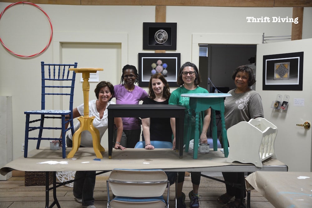
There are a lot of things I love about furniture painting classes, which I hold monthly for folks that live in the Maryland, DC, and Virginia area.
It’s not just the fact that I’m able to help people who have never lifted a paint brush before to complete their first project, or that it’s always been my dream to inspire people to be creative.
But it’s also the fact that I leave class feeling equally inspired, too!
If you’ve been following this blog for any length of time, you’ll know how much I totally loooove turquoise.
But when students come to class and pick their colors, often times they pick colors and pretty combinations that I have never considered before, which look amazing!
It leaves me excited for my next project and the awesome color combos that I could do for an upcoming project.
I wanted to share with you some of those combinations, highlighting the students’ projects from class this weekend!
Maybe you’ll feel equally inspired! 🙂
(And if you live in the Maryland, DC, or Virginia area, definitely consider joining me for an upcoming furniture painting class!)
Furniture Painting Class: BEFORE & AFTERS
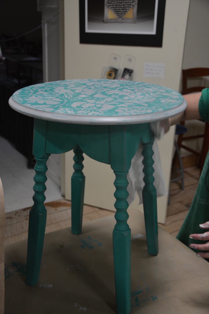
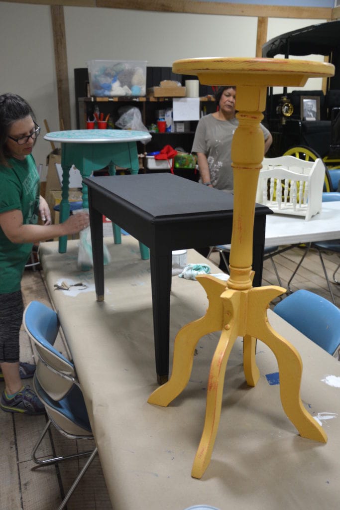
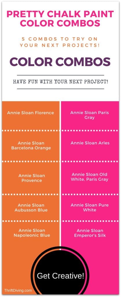
Color Combo #1: Annie Sloan Florence and Paris Gray
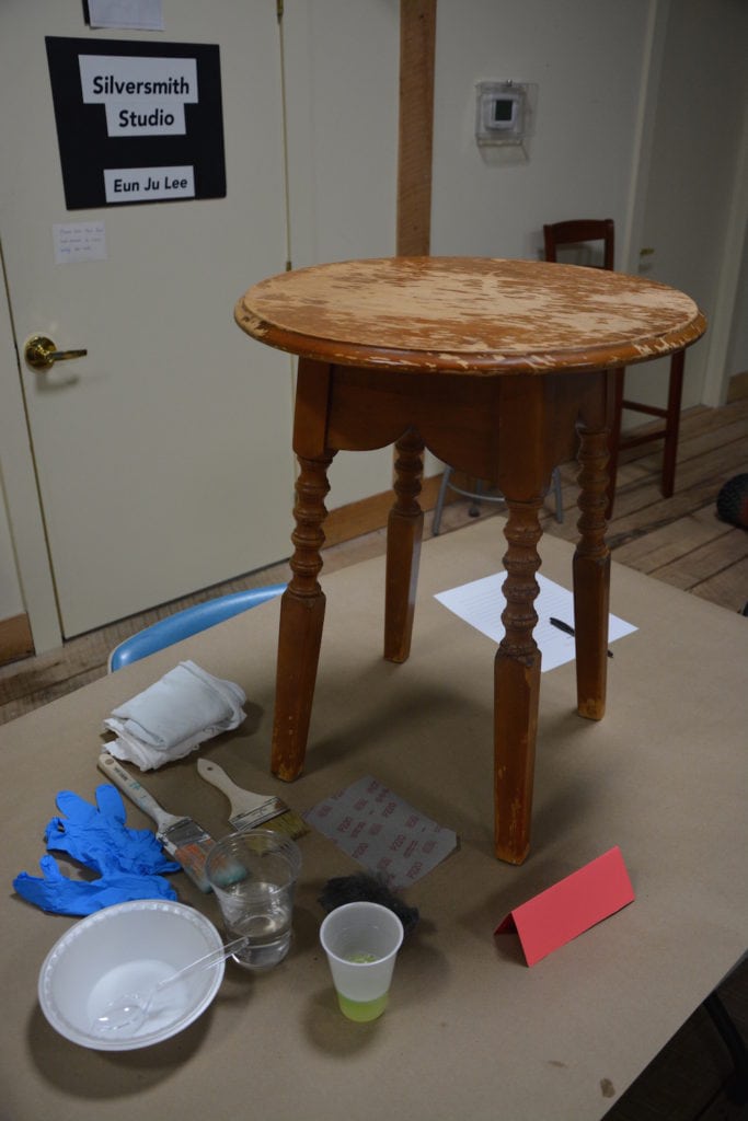
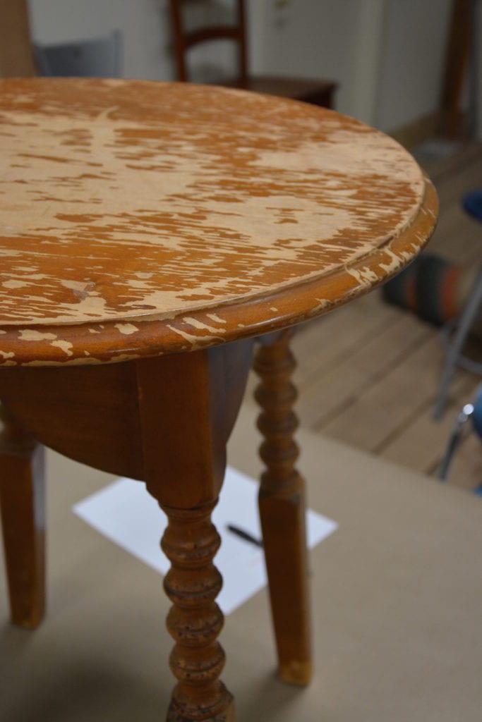
This sad little table had potential. I knew it when I saw it in the thrift store because was heavy and solid!
Most people would walk away from a table like this because it was chipped badly on top.
But I knew it would make a great project for a student in class because it was an opportunity to show them how to use an orbital sander, totally smoothing out those imperfections before painting!
After I took the students outside and everyone got a turn at using the sander, one of the students, Jen, got to work on this little table, adding a coat of pretty Florence all over.
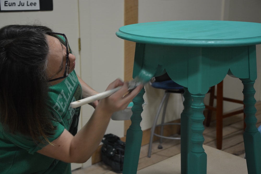
At first, she had planned to cover the whole thing in gray for a two-tone look, until she saw my favorite damask floral stencil and decided to stencil the top. I’m so glad she did! It looked soooo good!!!
TIP: Using Paris Gray with a stencil on top of a stronger color helps to soften it.
Paris Gray pairs well with so many other colors, especially Florence!
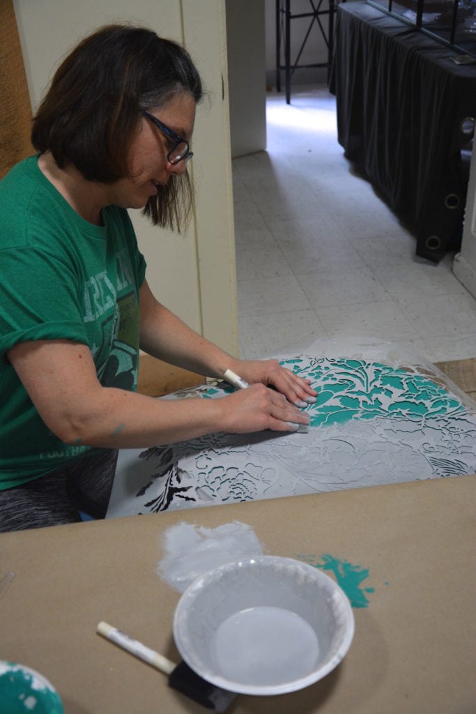
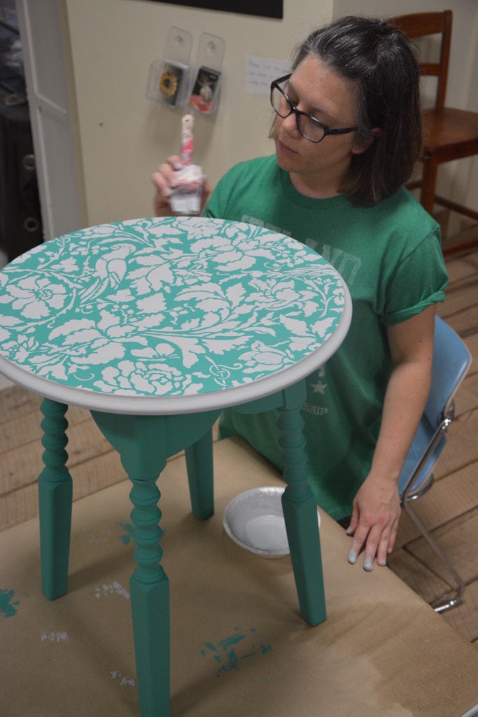
Next, she did some light distressing around the legs and top with medium-grit sandpaper, then added a coat of clear wax. (Check out this jewelry box makeover I did with Paris Gray as a stencil).
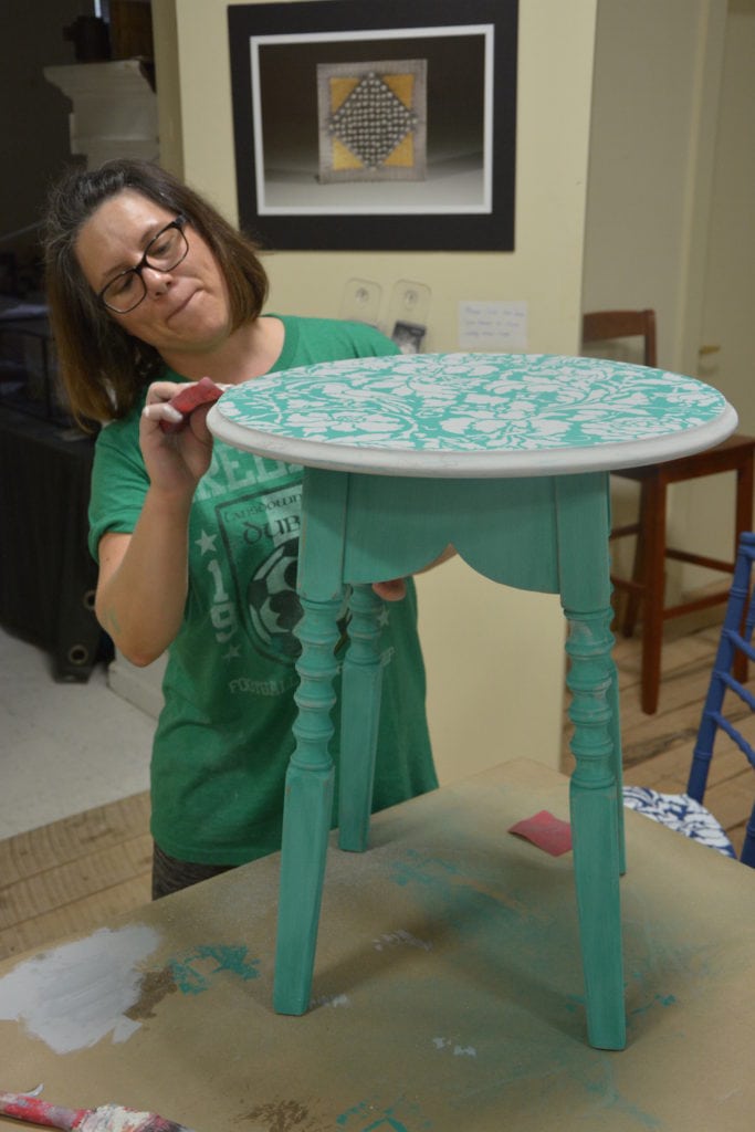
I think it looks amazing!!!
This is such a pretty color combination of Florence and Paris gray. I can’t wait to try it myself!
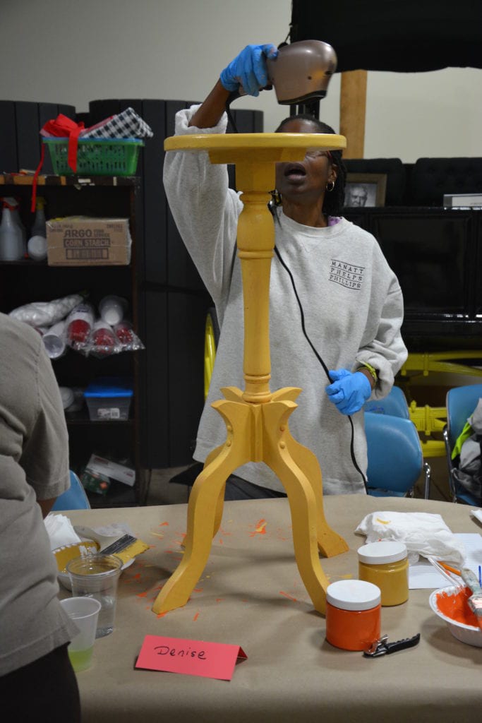
Color Combo #2: Annie Sloan Barcelona Orange and Arles
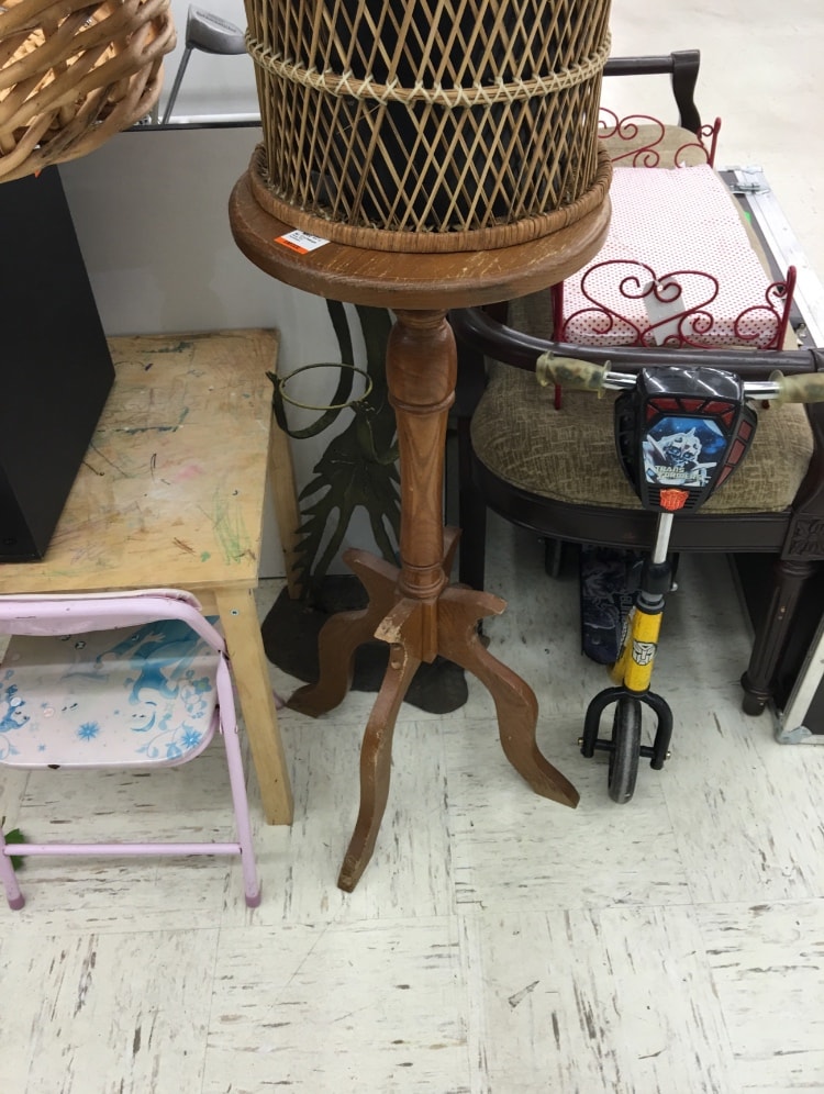
It’s so funny how I found this plant stand at the thrift store.
Well, actually, I didn’t find it. My thrifting friend, Pete, had found it (you can read all about Pete here).
If you remember Pete, he’s a thrifting pro that I met last year. It doesn’t matter what day of the week it is–if I hit the thrift store early in the morning, there’s a 95% chance I’ll run into Pete, who’s 10x the thrifting addict that I am!
Last week I happened to be at one thrift store and him at another, and we started texting each other pic after pic of stuff we’d found. I told him I was on the hunt for projects for my Furniture Painting Class, and he sent me this:
“Perfect!” I thought.
I hoped it would be there the following day when I could hit that thrift store, and lucky me, it was!
It looked like some dog had gotten ahold of one end, but I knew it wasn’t anything that wood filler couldn’t fix!
Denise, one of the students in class, chose this project.
When she first got started, she really wasn’t liking the orange because it was so similar in shade to the original color.
She hoped that the Annie Sloan Arles that would go on top would really make it look more like what she wanted.
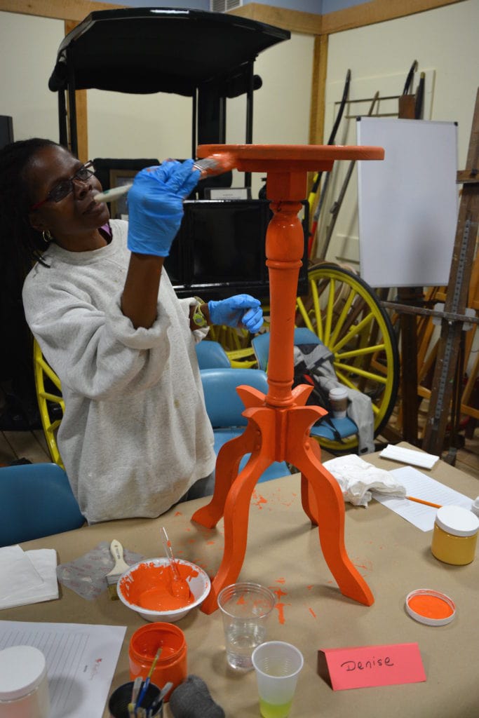
Even though she was uncertain, she kept going for it, and had such a positive attitude about it!
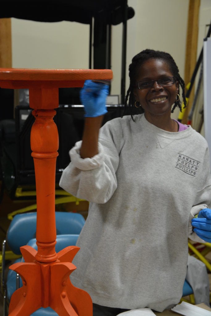
After a coat or two of Arles, along with some blow drying to speed up the drying, Denise was ready to do some sanding in order to bring out that Barcelona orange. She used a medium-grit sandpaper.
I absolutely love the finished look! It’s not a color combo I would ever have thought to put together, but now that I’m seeing it, I’m inspired to try this on a piece! This color combo has a lot of energy, doesn’t it?!
She joked that it looked so good and looked like something that she picked up from Home Goods, that she was going to try to “return” it to Home Goods to see if they’d give her money back for it! HA!! Good one, Denise!
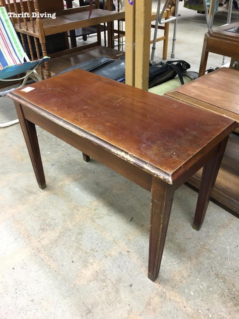
Color Combo #3: Annie Sloan Provence and Old White
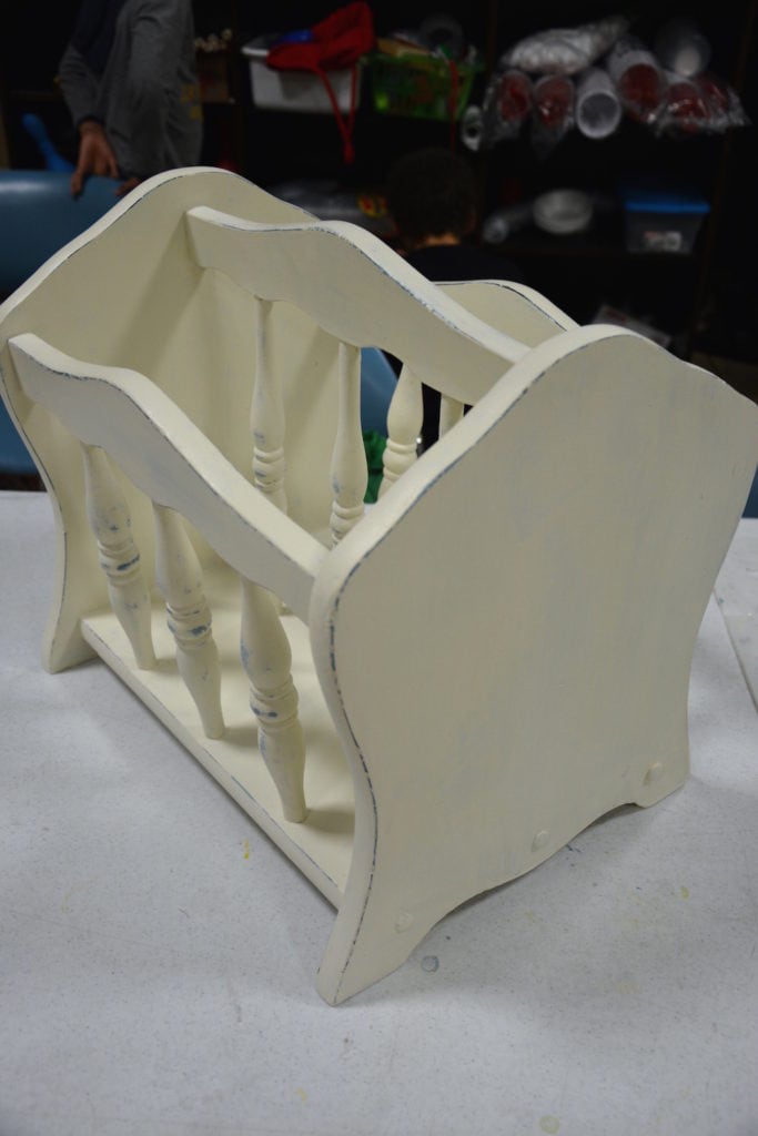
Oh, this poor magazine rack.
I can’t imagine how many people must have passed this thing in the thrift store, having no idea just how pretty it could be!
It was the perfect project for class because it had a bunch of scratches that were perfect for showing students how to use wood filler and how to sand it down to smooth it out!
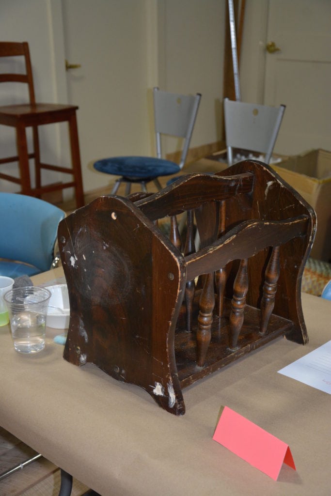
But this was a challenging project!
Do you know how difficult it is to reach inside of a magazine rack and paint 9 spindles?!
HA!
I was helping Diana with her project because it was like The Never Ending Spindles.
Finally, we got two coats of Florence on and was able to dry it!
This magazine rack was for her son’s house, and you know men don’t do turquoise, right??
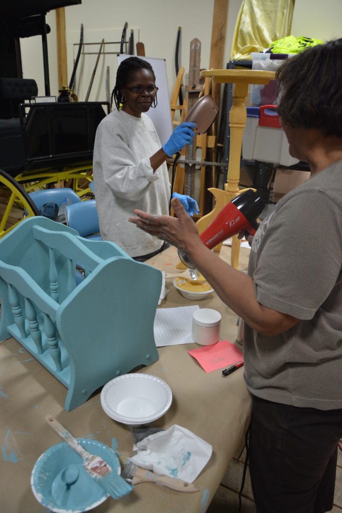
Men can do white….so that’s what she put on top, with the goal of pulling some of that Florence out from under the Old White.
She didn’t want to do too much distressing on this two-tone magazine rack, otherwise the son–well–you know how men are…We wanted him to be happy. 😉
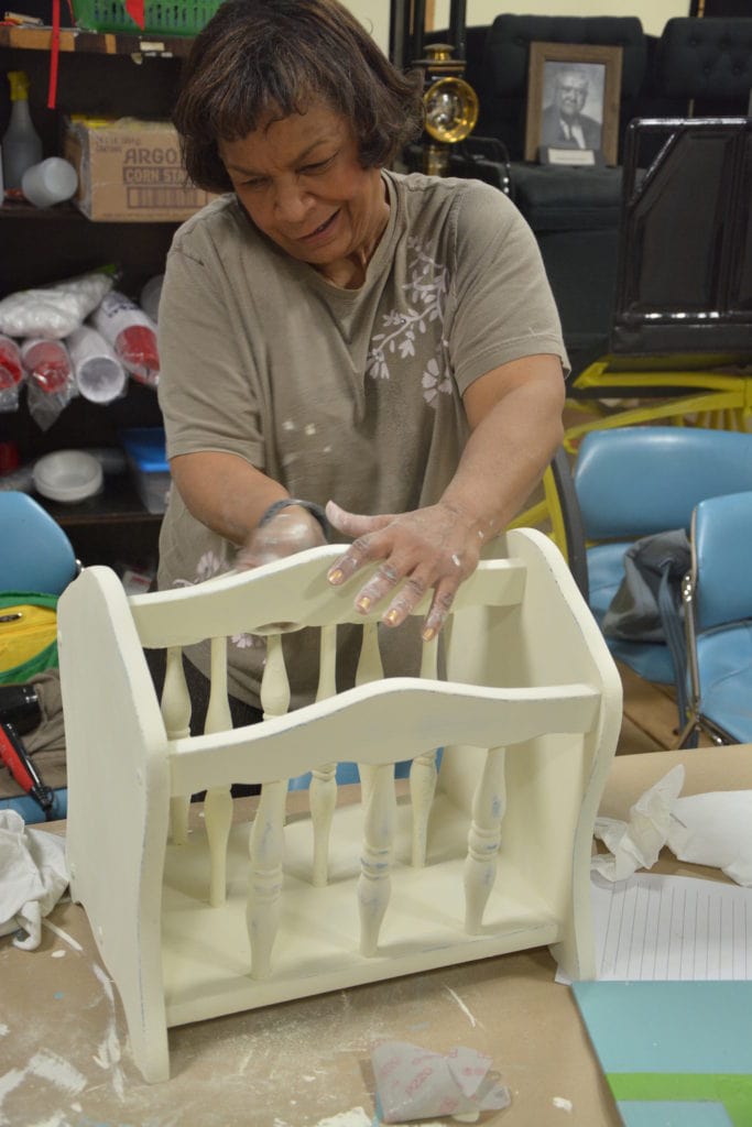
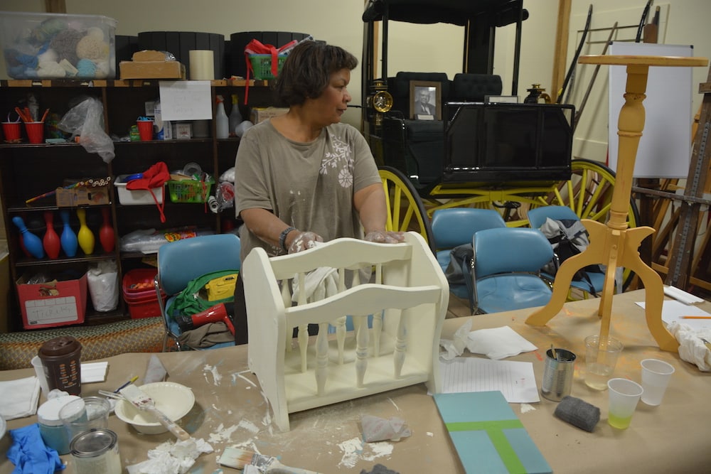
I think it turned out perfect with just the right amount of distressing to make it interesting!
…Even for a man’s house. 😉
TIP: Layering colors gives a piece of furniture a little bit more dimension than if you just distress it or paint it a solid color. Be sure not to press too hard or else you’ll remove too much of the color underneath. Distress around areas where natural wear occurs, like edges and rounded areas!
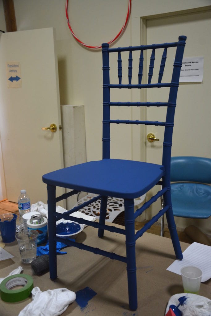
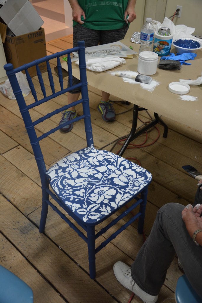
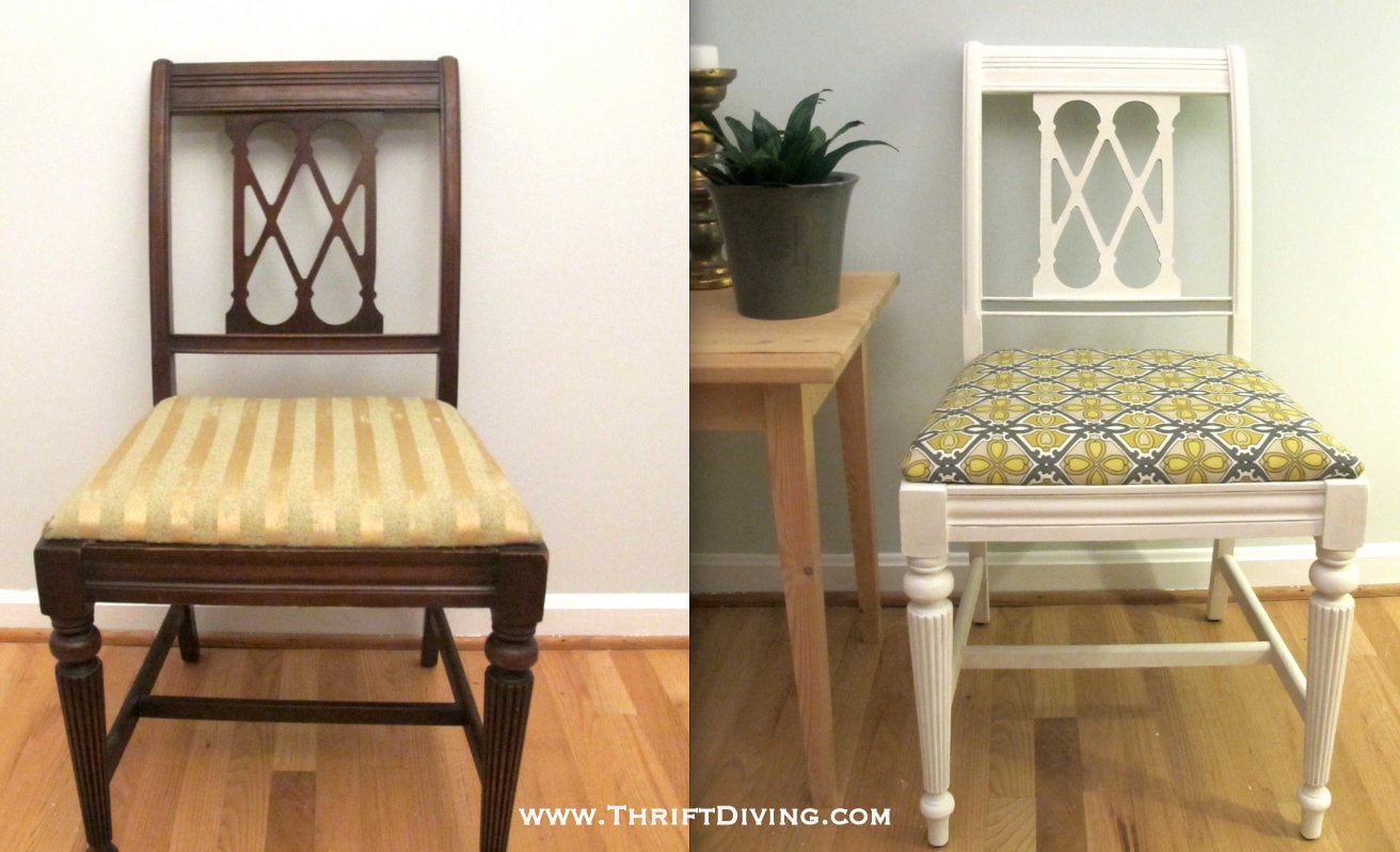
Color Combo #4: Annie Sloan Aubusson Blue and Pure White
If you remember, last month I had found (well, Pete had found them for me….LOL….) these four chairs for paint class. I ended up using 3 of them in class and had one left over for this class.
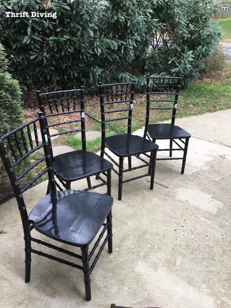
Susan loved the chair and knew immediately that she wanted to use Aubusson Blue and Pure White!
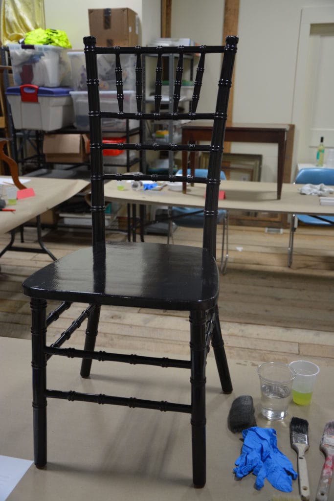
She had never painted furniture before but let me tell you something–this woman has a good hand for painting!
Most new students tend to have problems with loading their brushes too heavily, causing runs (which can be hard to clean up sometimes).
But Susan was really good with that brush and I don’t think I saw one drip!
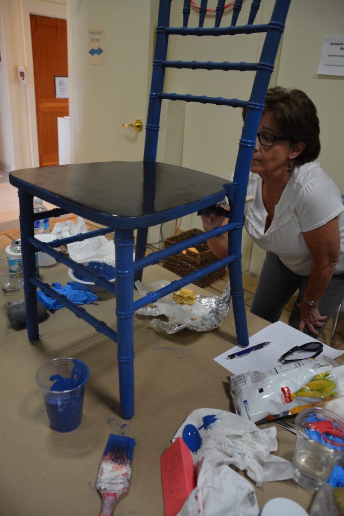
She thought she was going to paint the seat white, but after she saw Jen’s stenciled table top, decided she wanted a stencil, too. My pretty floral stencil was perfect.
So the seat got a nice coat of Aubusson Blue, too! (Isn’t that color stunning???).
Stenciling isn’t easy (have you seen the stencil I did in my bathroom?? It nearly broke my spirit on ever using stencils again! LOL).
Doing a chair seat isn’t easy, either, because you have to bend the stencil to fit around edges, which is difficult. And, of course, you want to make sure you don’t get seeping underneath.
But with Jen’s help (since I was helping other students), and a few touch-ups, they were able to pull off such a pretty chair makeover!
Susan loves shiny furniture, so she’s going to add a coat of glossy poly at home.
TIP: Pairing Pure White with a dark color makes that white pop even more and gives it a crisp look! One of my favorite looks is painting edges of tables or trim areas for more definition.
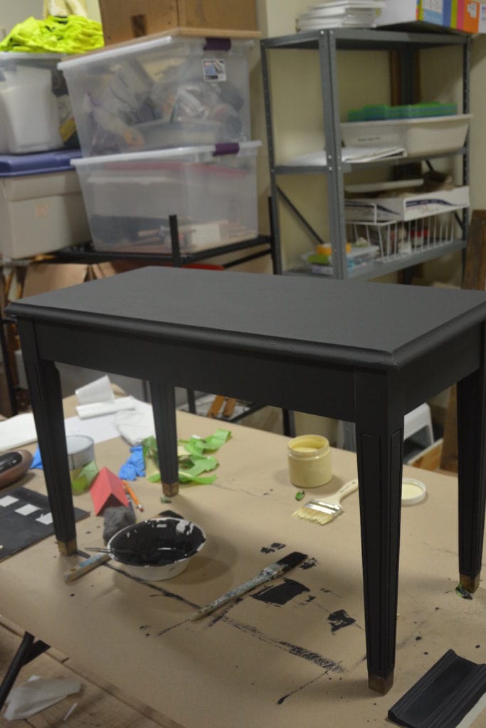
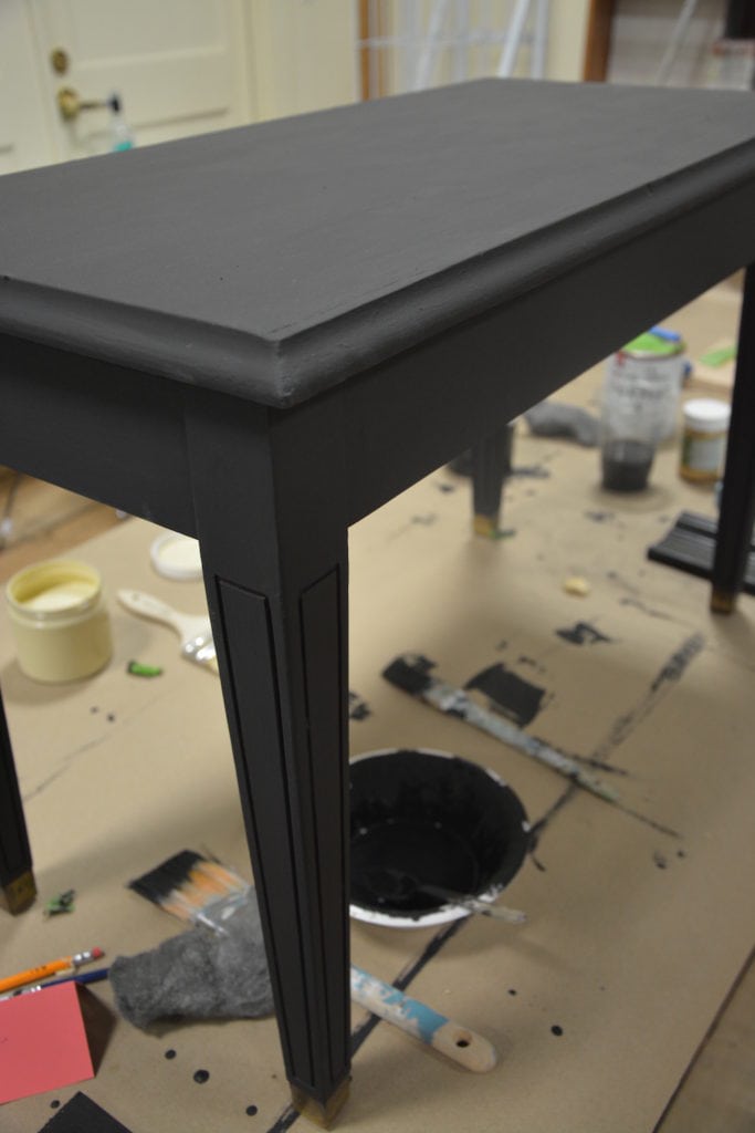
Project #5: Amy Howard Black & White
I don’t know why I almost walked away from this piano bench.
But I’m so glad I didn’t!
It was perfect for paint class!
I love that Lisa chose Amy Howard at Home Black paint.
If you’ve used Annie Sloan’s Graphite and Amy Howard’s Black paint, you know that they’re about 3 shades different.
Amy Howard’s Black paint is a true black, whereas the Annie Sloan is more of a dark gray.
That’s why I loving having both colors in class.
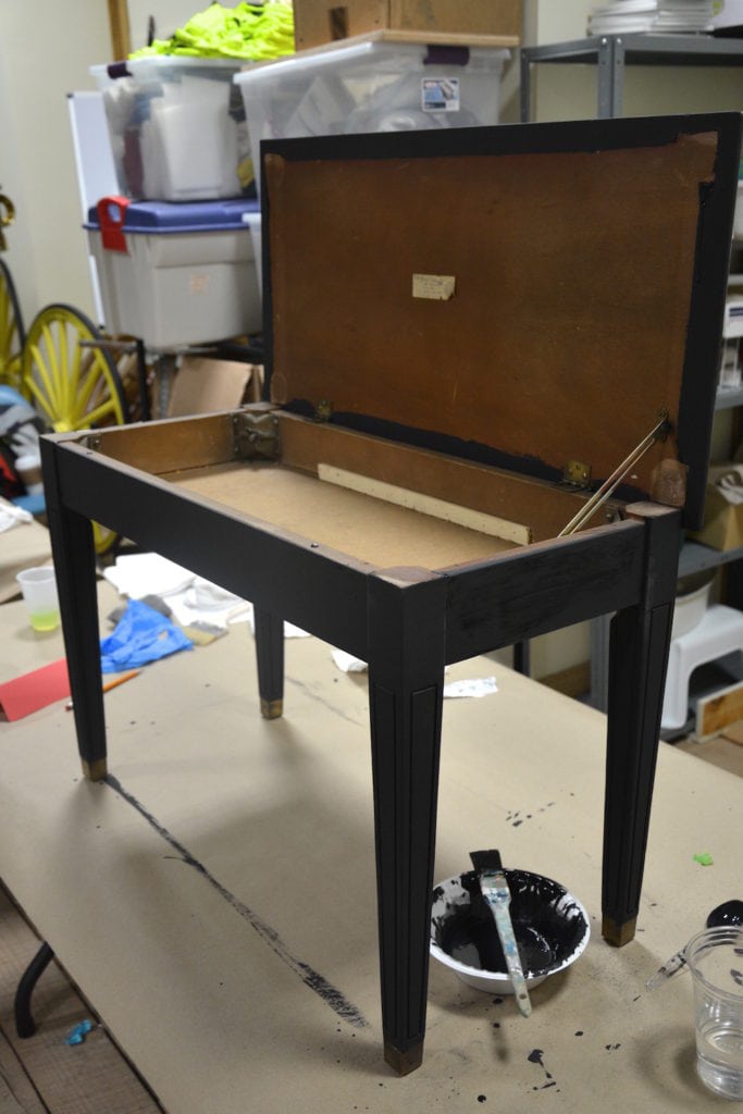
Amy Howard Black paint is soooo rich, it’s really one of my favorites.
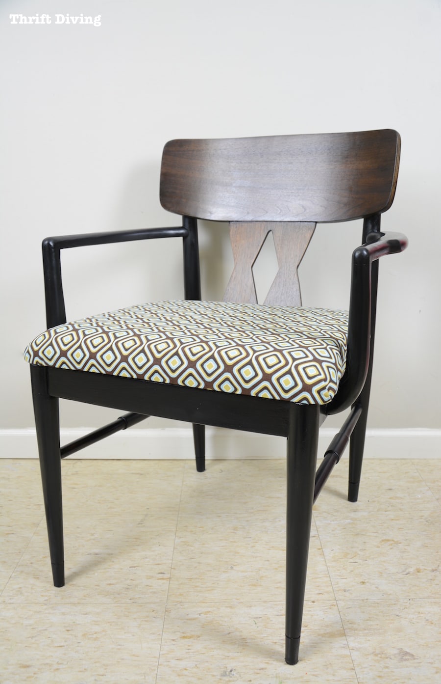
(See how I used Amy Howard Black for a Mid-Century Modern Chair Makeover)
And the thing I like about this black is that it’s so “hearty” that even if you went with one coat, you could probably get away with it.
Most paints, however, you need two coats.
Anyhow, Lisa wanted a black and white checkered pattern on top. Since she has a stencil at home, she is going to finish the top there, and then add some poly to make it glossy. (Here’s a great checkered stencil from Amazon).
(TIP: Be careful with using polycrylic on whites because it can yellow them, even though it says “non-yellowing.” Do a test area first to make sure!)
I can’t wait to see how Lisa’s project looks after she used the stencil!
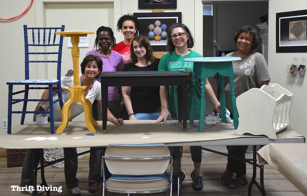
A Fun Furniture Painting Class!
I had a great time with this bunch of ladies!
And what I like best is that class was small.
I’ve tried doing larger classes (like around 10 people) and it was a disaster. Too many people, not enough space, and not enough individual attention.
With fewer people, it was more cozy, and I think everyone appreciated that!
And how awesome that my son’s had great behavior again!
I left them in the library there at the Sandy Spring museum and they were happy as clams with their electronics and pizza that I ordered for them!
Anyhow, I hope these fun color combos inspire you for your next furniture makeover project, because I know that I’m super inspired, too! 🙂
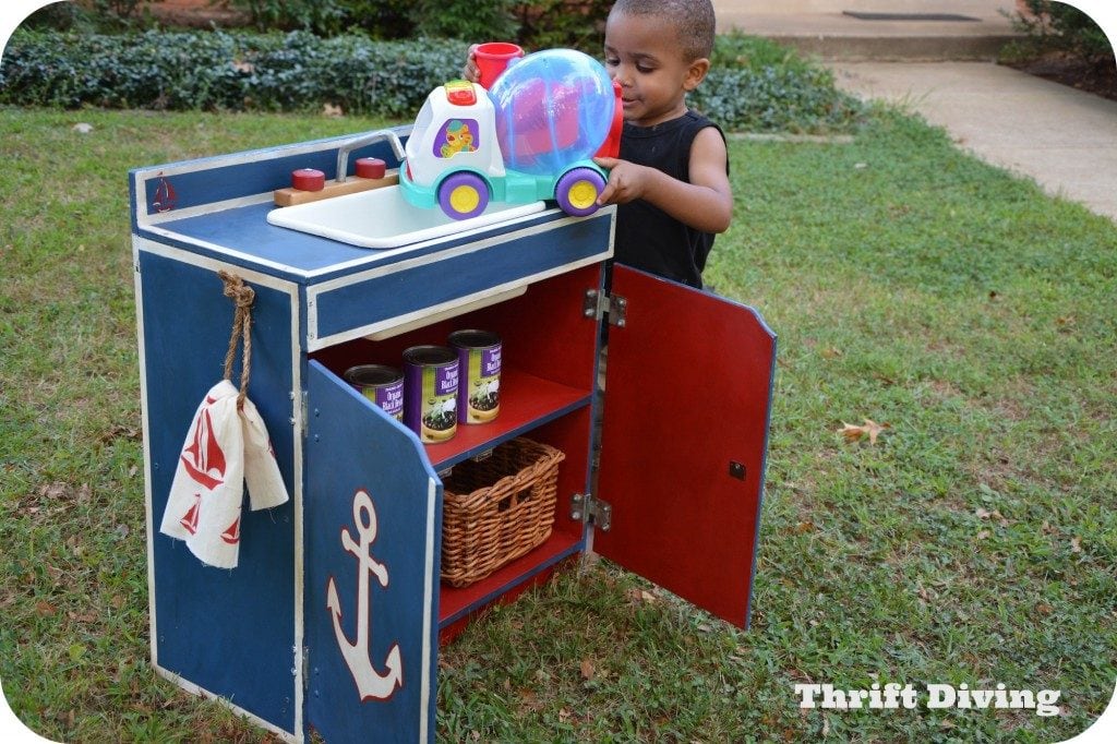
P.S. Here’s a little bonus color combo that I really like for kid’s projects: Annie Sloan Napoleonic Blue with Emperor’s Silk! Add in some fresh white for a fun look! (See this kid’s play sink makeover from the thrift store).
Want to save this project? Click here to save it:
![]()

Resources
- Looking for furniture painting classes? You can register HERE.
- This Floral Damask stencil is my favorite and I have here on many projects. Get it HERE.
- I like to buy Annie Sloan chalk paint online HERE.
- Amazon sells Amy Howard at Home paint HERE.
- Nervous about using Power Tools? Sign up for my hands-on class HERE.
![]()
So which of these color combo do you like the best? Do you have any favorite color combos?
Leave a comment below and let’s chat about it!

Download the 5 freebies!

Thrift Diving inspires women to decorate, improve, and maintain their home themselves...using paint, power tools, and thrift stores! Use these 5 printables, checklists, and ebooks to get started!
All these girls did such a super job on their pieces!!!
Thank you, Heidi! I agree!
I really do love seeing your name come up on my email list.
So much fun to read what fun things you do and that you share your time and talent.
Have a wonderful day!
Awww…..that means so much to me!! 🙂 Thank you!! Let me know if I ever start to bore you, okay? Then give me a swift kick in the butt! LOL
Hi Serena,
The ladies did a great job. Can’t decide which was my favorite. When I see all the colors it really inspires me to not be so boring and plain!!
Only wished I was closer in the area(I live in NC ) to take advantage of the classes that you offer.
Please share a picture of Lisa’s finished piano bench if you get one.
Love the blue chair and turquois table. but I think all of these ladies did a fabulous job.
GREAT WORK LADIES
Thanks, Betty! I’m sure they will appreciate the feedback! I think they did great, too!
Look at you. Helping so many people improve their homes, and empowering them, too. Good for you,. Serena. It is such a win win situation. And even your sweet boys are a part of things. And, as usual, you are taking all sorts of great photos. You are a natural teacher, Serena.
Hi, Joan! 🙂 Want to hear an interesting story? Well–it’s interesting to me. Several years ago, back when I was working a day-job that I must not have liked or whatever, I remember being frustrated, thinking about my purpose in life, yadda, yadda, yadda, and I decided that I would pick 5 keywords that would sum up my purpose. And of those 5, I only remember 3 of them: CREATE, INSPIRE, TEACH. Since that time, I have come to cherish these words because it’s the reason I do what I do. This blog and these paint classes give me the platform to do just that. 🙂 And after “owning” those words, I have never felt “lost” again about my purpose in life. So thank you for letting me do that!!
I remember you writing about being so fatigued and burned out on that job. And how you soon “lost” that same job. And how I wrote to encourage you and that things would work out. And here you are, doing what God probably created you to do. Encouraging others. Giving them more of a sense of expressing themselves. Showing women that they are Not Powerless. What you do, Serena, is more than giving furniture and facelift, it is sharing what you have learned to change people’s lives.
Yes, I remember that! Thank you for that, Joan! And do you want to know what’s hilarious? (Well, I think it is hilarious…). Yesterday I happen to run into my old supervisor from my last job, the one that I butted heads with on a daily basis. Oh, it was sweet seeing the look of disbelief and contempt on her face! LOL And all I did was smile and pass by with a “Hi!” as artificial as artificial can be! 🙂 Felt victorious! LOL
You WERE victorious, Serena. And you handled it with grace. Building character is challenging.
You know, another thing that is wonderful that has come out of all you have gone through is that YOU are the one that is raising your sweet boys. They are not at childcare, but with their mom. It is only in recent years that I have become aware of how much I missed my mother as she had to work so much. Kids are resiliant but there is nothing like having your own mother there for you.
Proud of you, Serena.
LOL, great point, but my youngest definitely IS at daycare! There is no way I would have him home because he would be raised on electronics. I’d much rather him be at daycare where he does school work and gets to play with his friends. My middle and oldest are in school. Those two will be home during the summer, so that will be interesting. I’ll try to create time for them so that they aren’t on electronics all summer! But yeah, working from home is still very time consuming and even now as I type this, it’s 7:20 p.m. and I’ve been up working since 4 a.m. this morning (with breaks to take and pick them up from school). So, I’m actually MORE busy now, or at least, the same level of busy-ness!
Love every single project! The colors are great! Which confuses me even more. I have a decision to make. I have a great dining room table – was my big sister’s originally ($100 in 1965). It has found its way to me – in fairly rough shape, but the wood is intact – with a little glue from a repair showing on the pedestal legs. Do I paint it all (I want it in my dining room where other things are all brown wood)? Paint just the pedestal and refinish/stain the brown top? Or refinish it all with new stain? I took it to a “professional” refinishing store here and they want over $750 to refinish it 0r $550 to paint it! Whaaat? DIY is definitely the way to go but I don’t want to mess it up!
Hey, Gretchen!! Wow…..yes, you have a huge decision to make!! I can’t tell you exactly what to do with the table, because it depends on what you want to do with it. I think all of those options seem reasonable. Have you ever painted furniture before? Have you ever stripped and restained something? Restaining is a big job, but it’s possible that if the pedestal legs are in good condition, then you may only need to restain the top. Restaining can be tricky because it could turn out blotchy if you’re a newbie at it. But as for paint….if you use a quality paint, like Annie Sloan, it’s nearly impossible to mess up!
AND….it also depends on how each look would fit into your dining room. If everything is already wood, would the painted piece stand out in a not-so-good way? Or if it’s brown, would that be too MUCH brown?
Send me a picture and let me see! Th**********@***il.com
a great blog! I loved the projects! Makes me brave, I can do this too.
Hi, Barbara! Awww…thanks! I’m glad you like my blog. And yes, you can do this, too! I find that it’s more about confidence than anything! If you can build up the confidence, then you can do (almost) anything! 🙂
Hey Serena,
Oh how wish I lived closer, I’d be at every class!! lol I love all the colors and projects those wonderful ladies completed. I need to get one of those fantastic chairs, I love the bamboo look of them. My color combos are, for bold and bright, orange, turquoise and white, for something more demure, seafoam green, creme and mauve. I did redo an over the sink shelf with red, green and creme, using acrylic paints, it’s what I had, than distressed it so you can see the red and/or green showing, I covered it with a matte finish. I now have it in my bedroom holding old blue mason jars.
Love ya’
Hey, Patricia! I know we’re talking about furniture paint here, but have you ever sued Sherwin Williams Sea Salt? It’s a seafoam green that is sooooo pretty. I have it in my foyer but you’d never know it was “pretty” by the way the kids have marked it all up. HA! Just wanted to throw that color out there to you if you’re ever re-doing a room and want the demure, calming colors!
Thanks, girl!
Looks like such fun! I’d have to go with the turquoise table for myself, but I agree with you that it’s fascinating to see other folk’s ideas! Really makes one stop and think! All great results!
I love the turquoise-y green table, too, Teckla! Yeah, it’s pretty cool to see what people choose! We get stuck in a rut of choosing the same colors, so sometimes it’s good to try something else!
Wow!! Amazing work on all of those projects! Well done ladies!! Ok so my favorites are the little table that is now turquoise and white and the gorgeous chair!! I love, love, LOVE that blue!!! Honestly, the magazine rack was too light for my taste…it is still beautiful, but I am super drawn to color and probably would have chosen darker or brighter colors for it. I have a couple of things in mind that need work…one is for the bathroom…I like blues, I like greens, I like light colors stenciled on or distressed or painted around edges to make them pop. I found some chalk paint at Walmart in the craft area, I’m thinking of looking online to find the matching wax and maybe buying a bottle or two. Really, I just love seeing what you do and how you teach people. So inspiring and so much fun. I sure wish I lived close enough to come for a class!
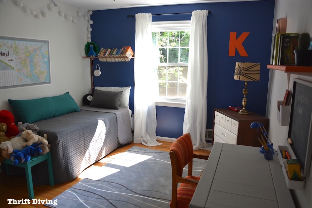
Yeah, that chair was AH-mazing. I was inspired by the color and have decided that when I tackle my son’s (the 9-year-old) room, I’m going to paint his desk in that same blue. It’s so rich and deep! As for the magazine rack, yeah, it’s definitely light, but since she’s giving it to her son and is blends well with his dining room, she went more neutral. I loved the Provence before it was painted white, but that’s my favorite color and I could paint EVERYTHING that color! 🙂 I don’t think a man would enjoy it, though. HAHA. Thanks, Janice!!